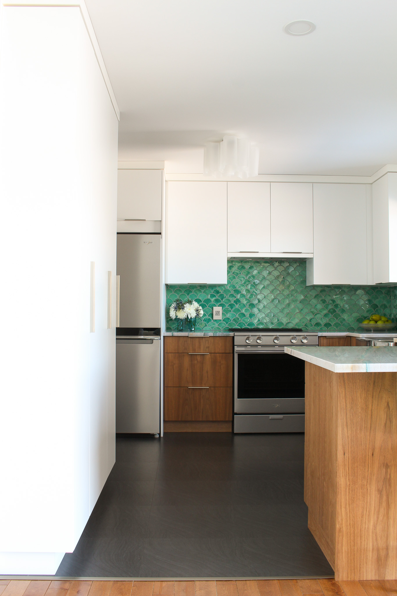
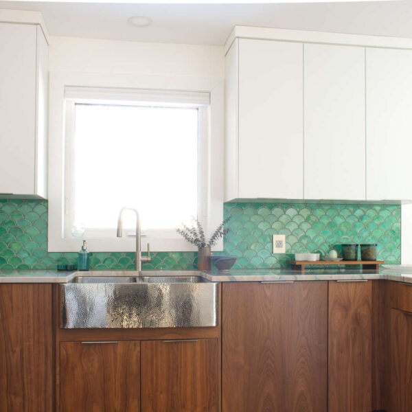
Full disclosure: my mid-century meets coastal kitchen reno reveal is a sham, because we’re not technically 100% done. I still want to make some walnut stools, and we have yet to actually glue down the flooring transition OR finish installing the baseboard. BUT, after finally getting the counters replaced and the backsplash tile installed, it feels complete enough – and I just really, really, really wanted to show you! I started this kitchen renovation over two years ago, and if I wait until it’s done-done to share we might all be living on the moon by then. Usually my spaces keep evolving, so little details will change anyway. Let’s just dive into the kitchen renovation reveal (and you can get caught up on all of the progress and delays right here).

The Portomare Quartzite Counters
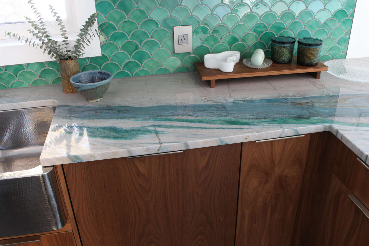
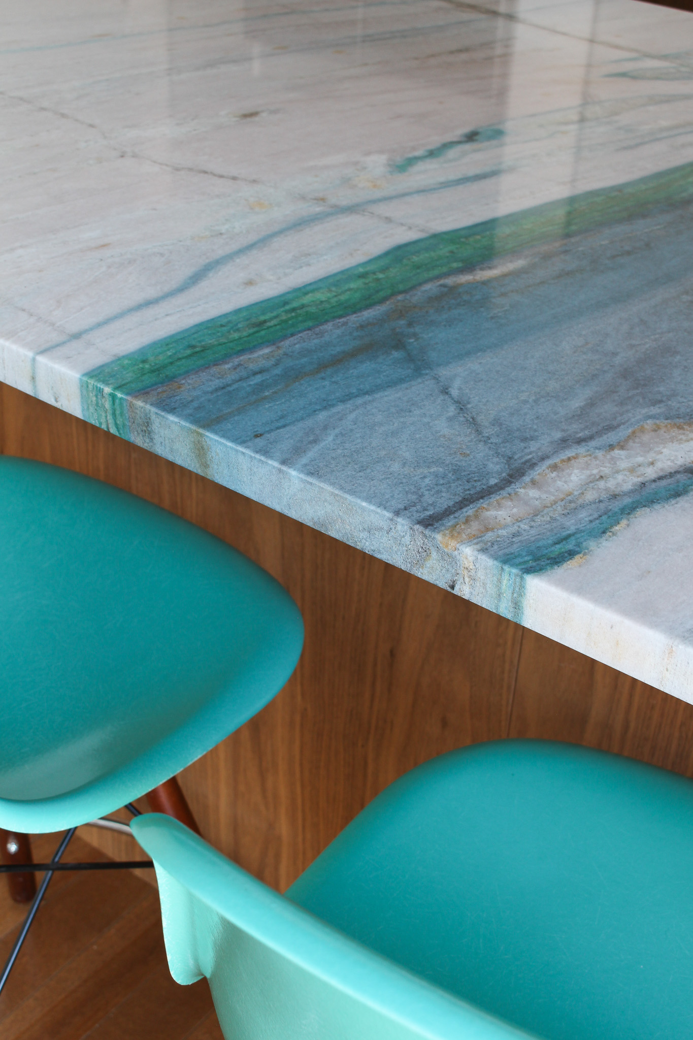
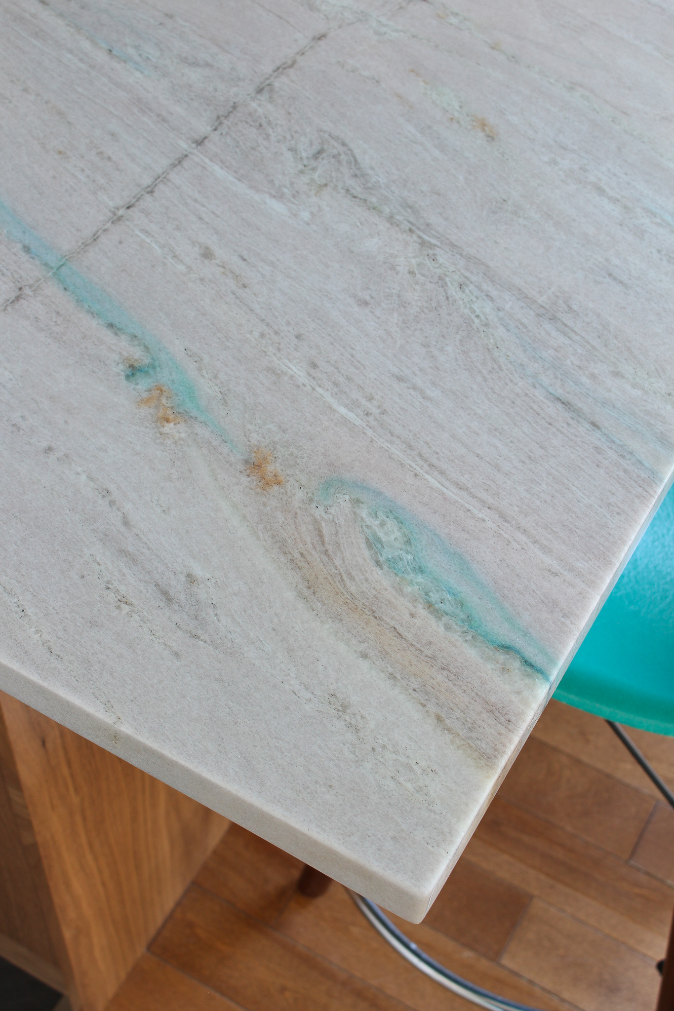
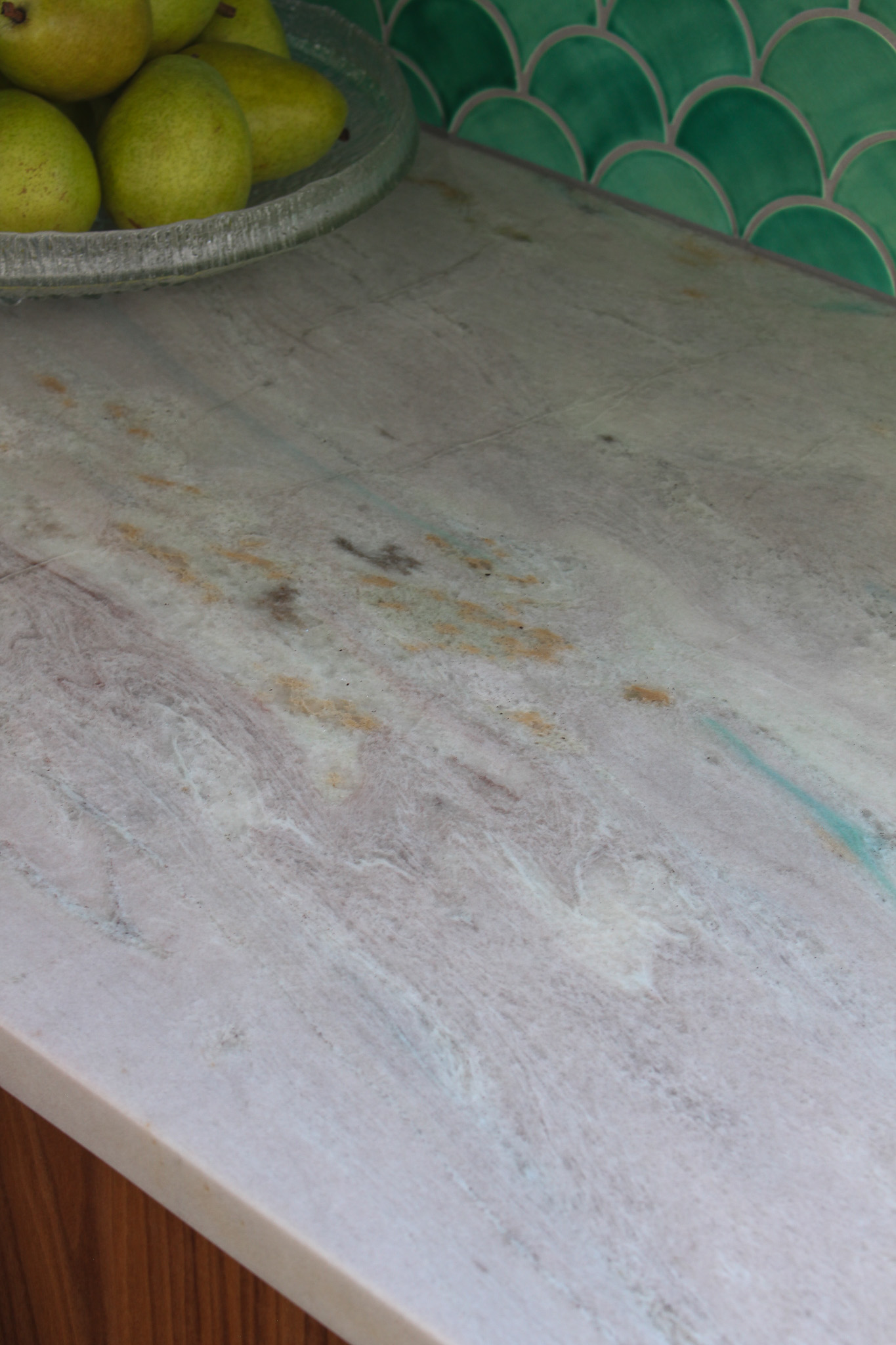
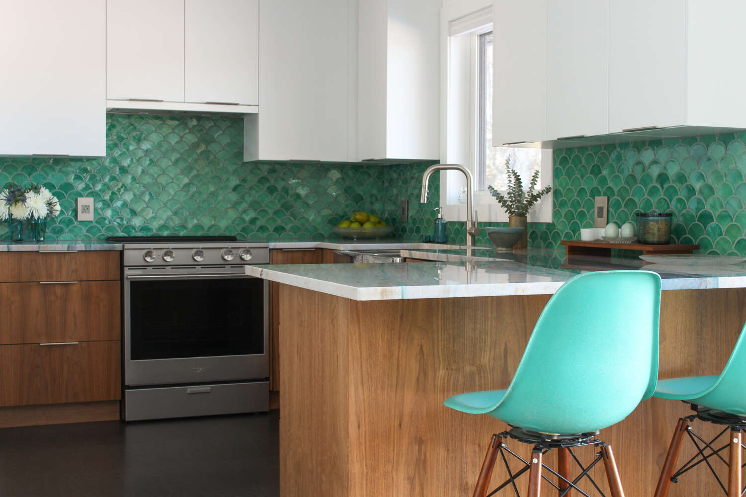
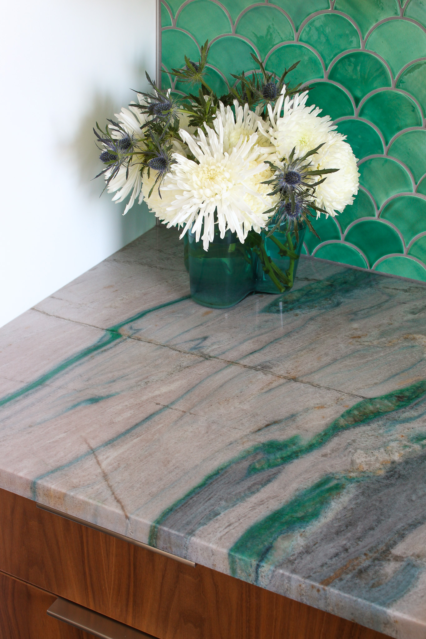
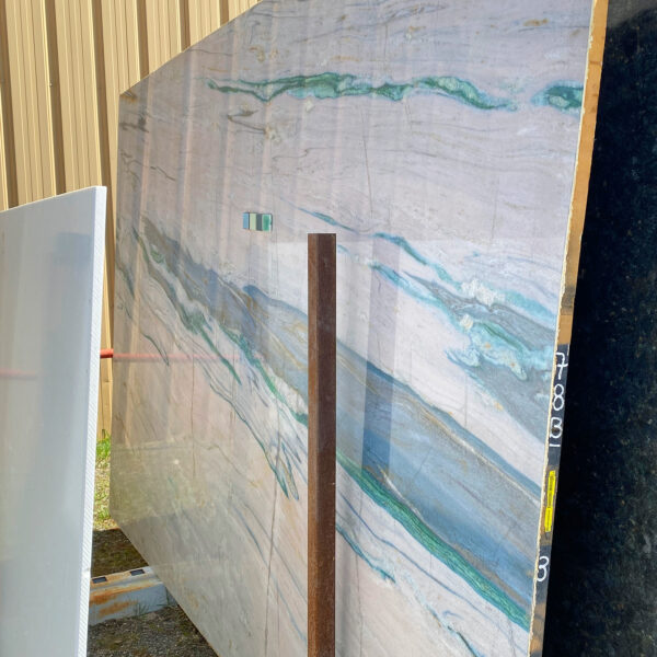
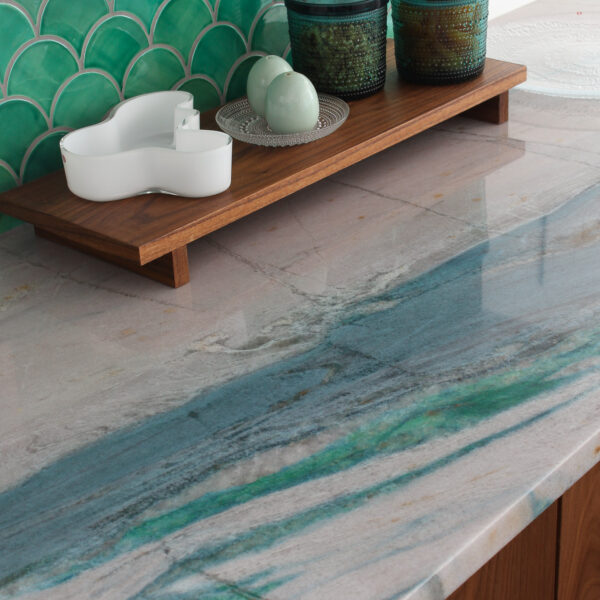
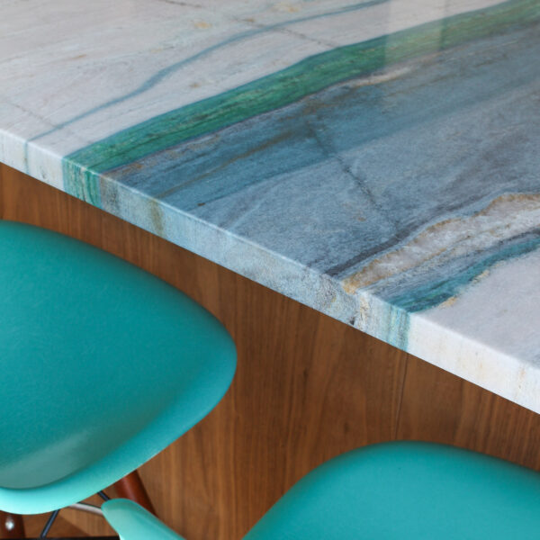
UGH these COUNTERS! What a nightmare!! But they turned out so beautifully in the end, and every day I get a serious dopamine hit from looking at them! You might remember that after getting the wrong stone slab brought in, I had to start from scratch finding a stone slab but eventually found – and fell in love with – this stunning blue/teal/green veined Portomare Quartzite. After waiting six months to get it shipped here, the fabricators absolutely ruined it upon installation. Unfortunately, the stone was totally sold out, so I could not get an exact replacement and, because it’s rare, I could not even find another place that carried anything similar. I was really disappointed, so imagine my delight when an identical slab was suddenly available again. A new fabricator brought it in for me – but I had to wait more than six months again. It was worth the wait because it was installed so perfectly this time around! And I still love it!
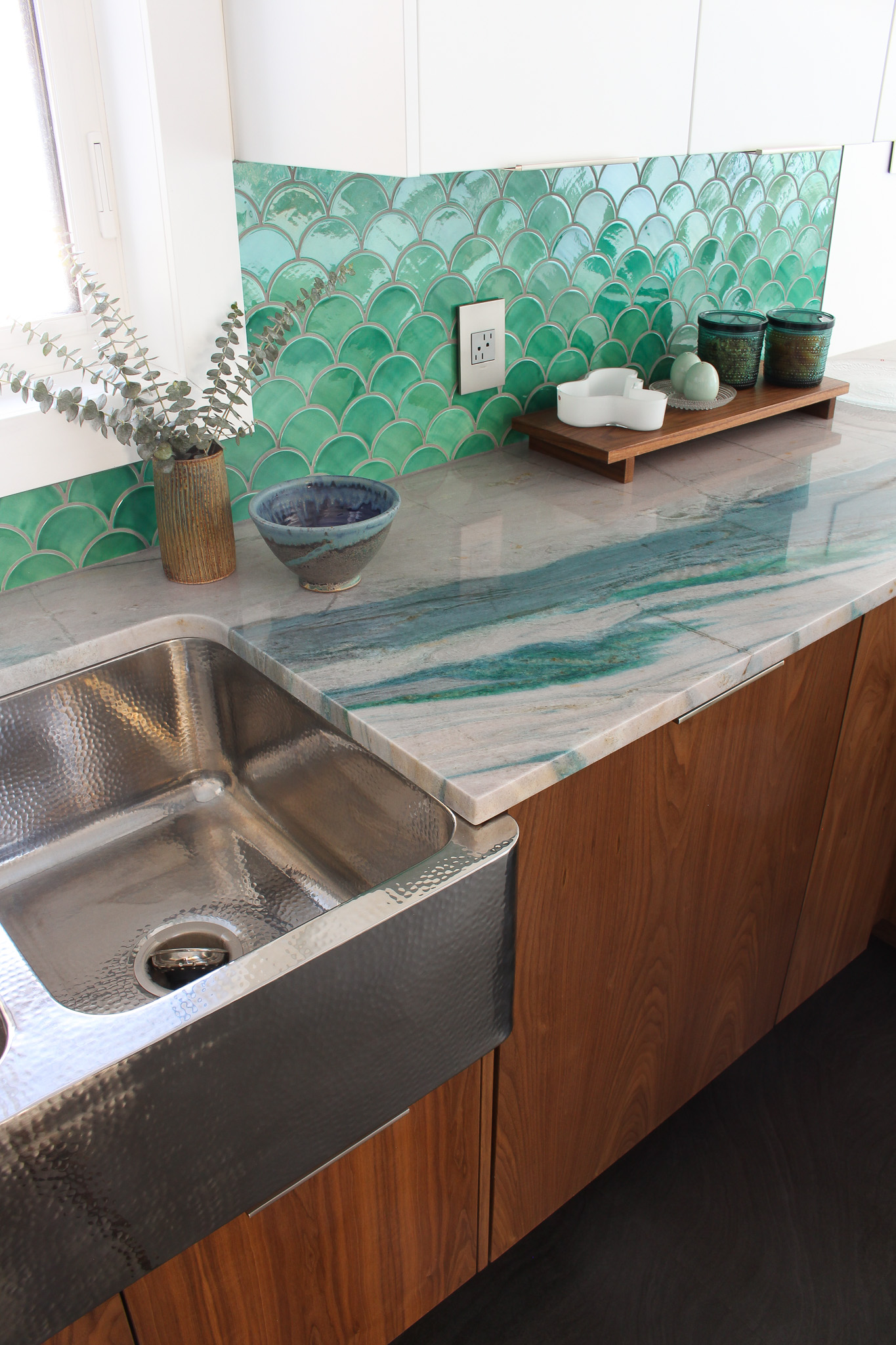
The New Stone Seam Placement (Under the Faucet):
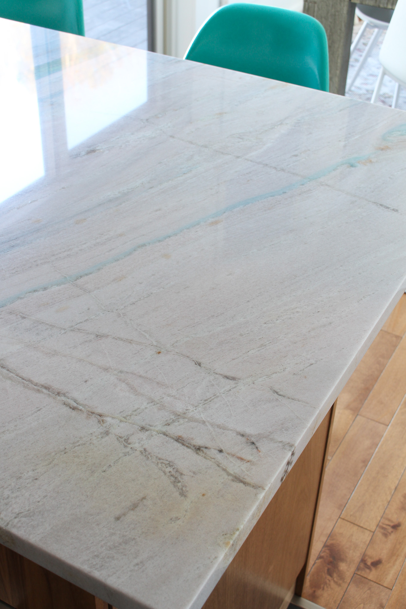
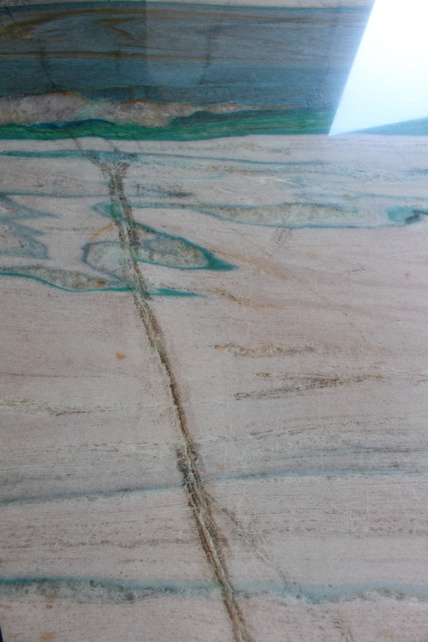
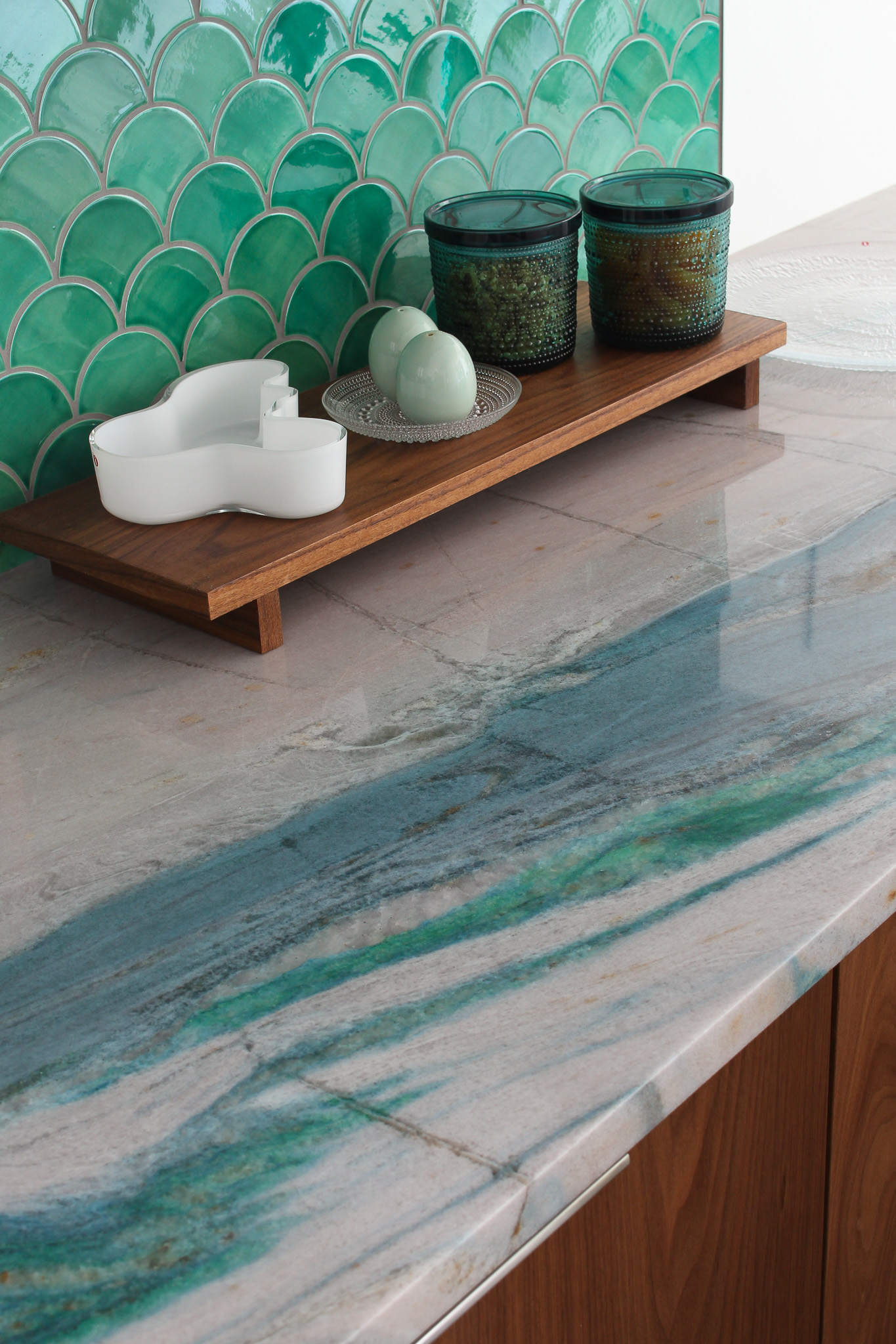
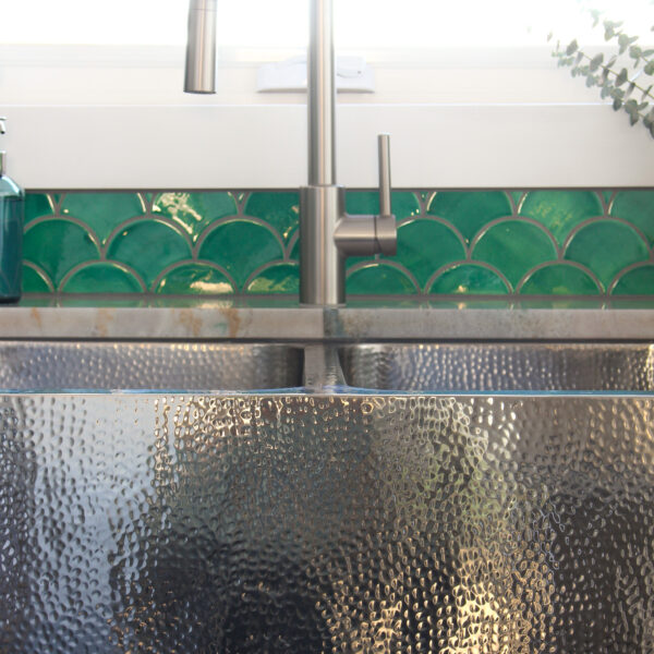
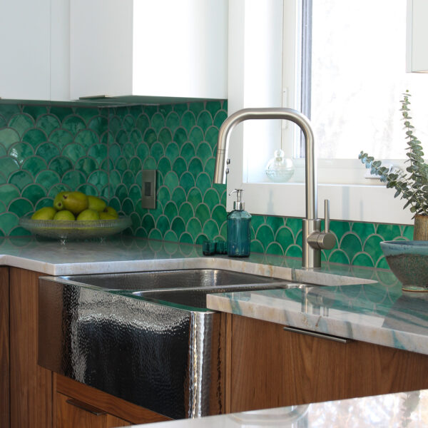
The new fabricators even talked me into a different orientation and seam placement, which was absolutely the right call (even though I was so stubborn about it). I had tried so hard to maximize the vein going through the stone, but that created some awkward seams. With the new installation, there is only one small seam, located underneath the faucet:
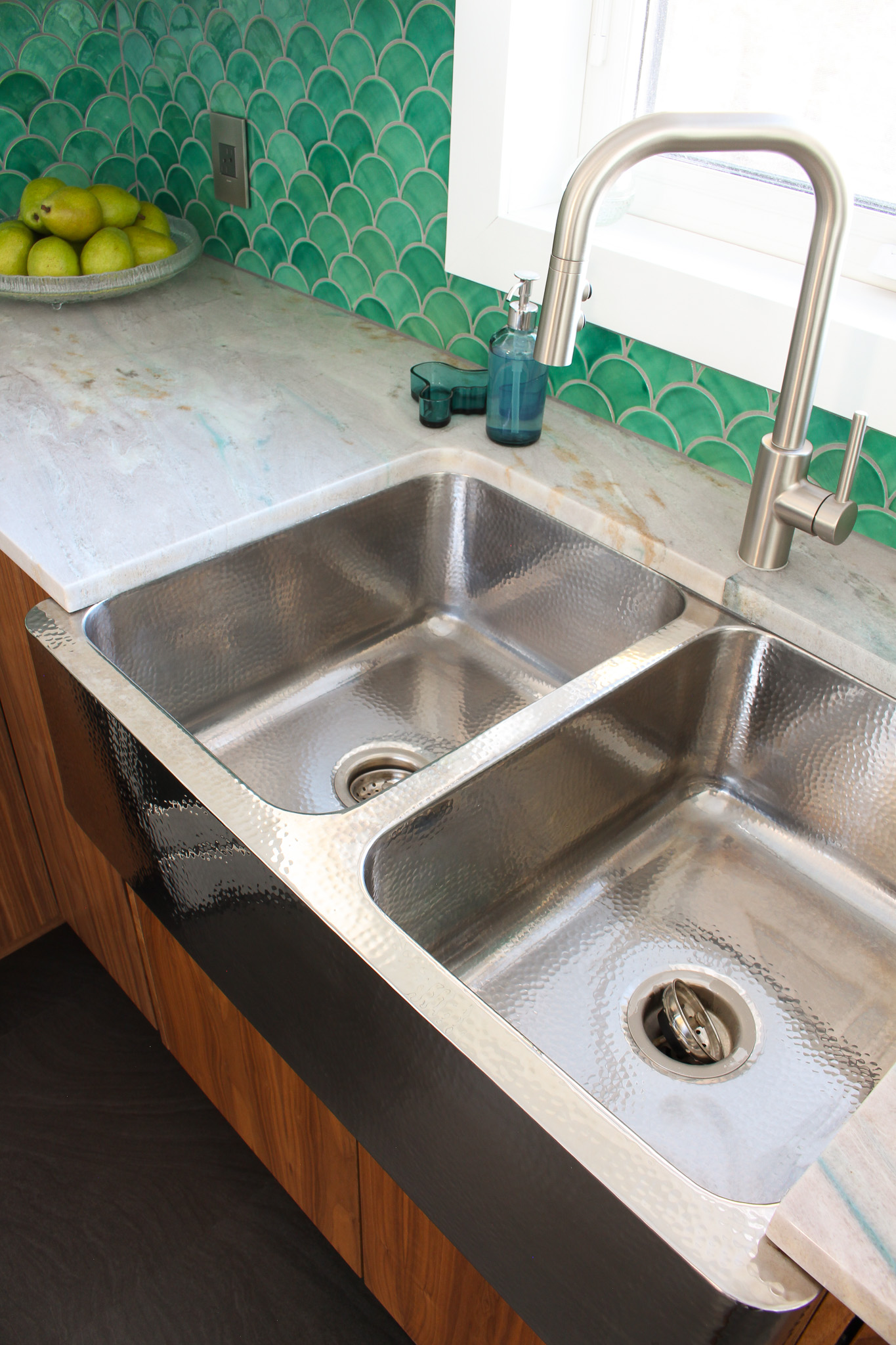
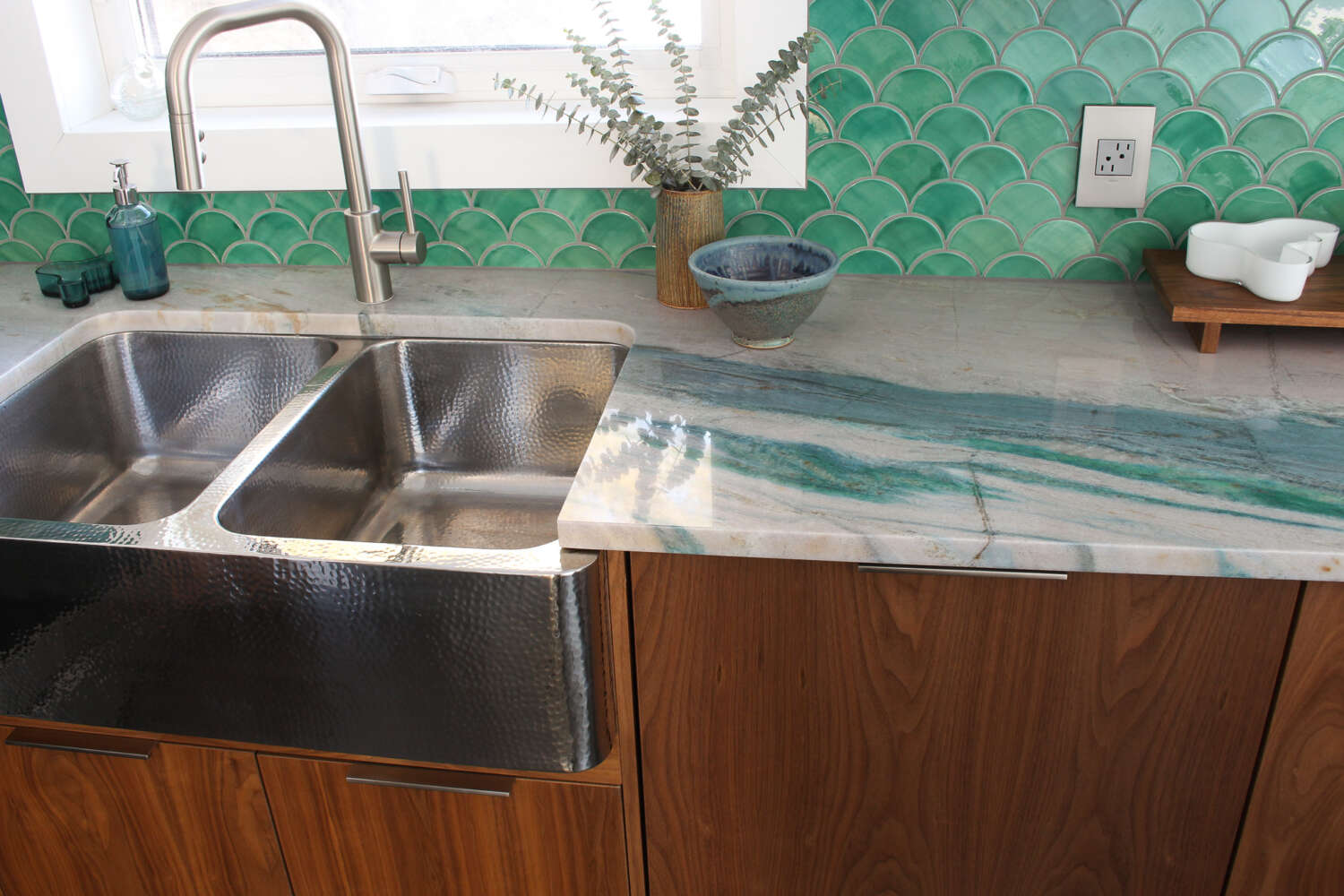
Somehow, with this new orientation, even more colors are visible and it flows much more beautifully now. Plus, areas that seemed beige under the bright sunlight of the stone yard actually have soft veins of aqua! Every single inch of this stone has an area that sparkles or glows, or boasts a soft hint or strong vein of color. I cannot stop staring at it, even months later! And honestly, it 1000x prettier in real life than in photos! My fears of it looking bland orientated this way seem totally nutty now. No area is bland.
The Mercury Mosaics Sea Mist Backsplash
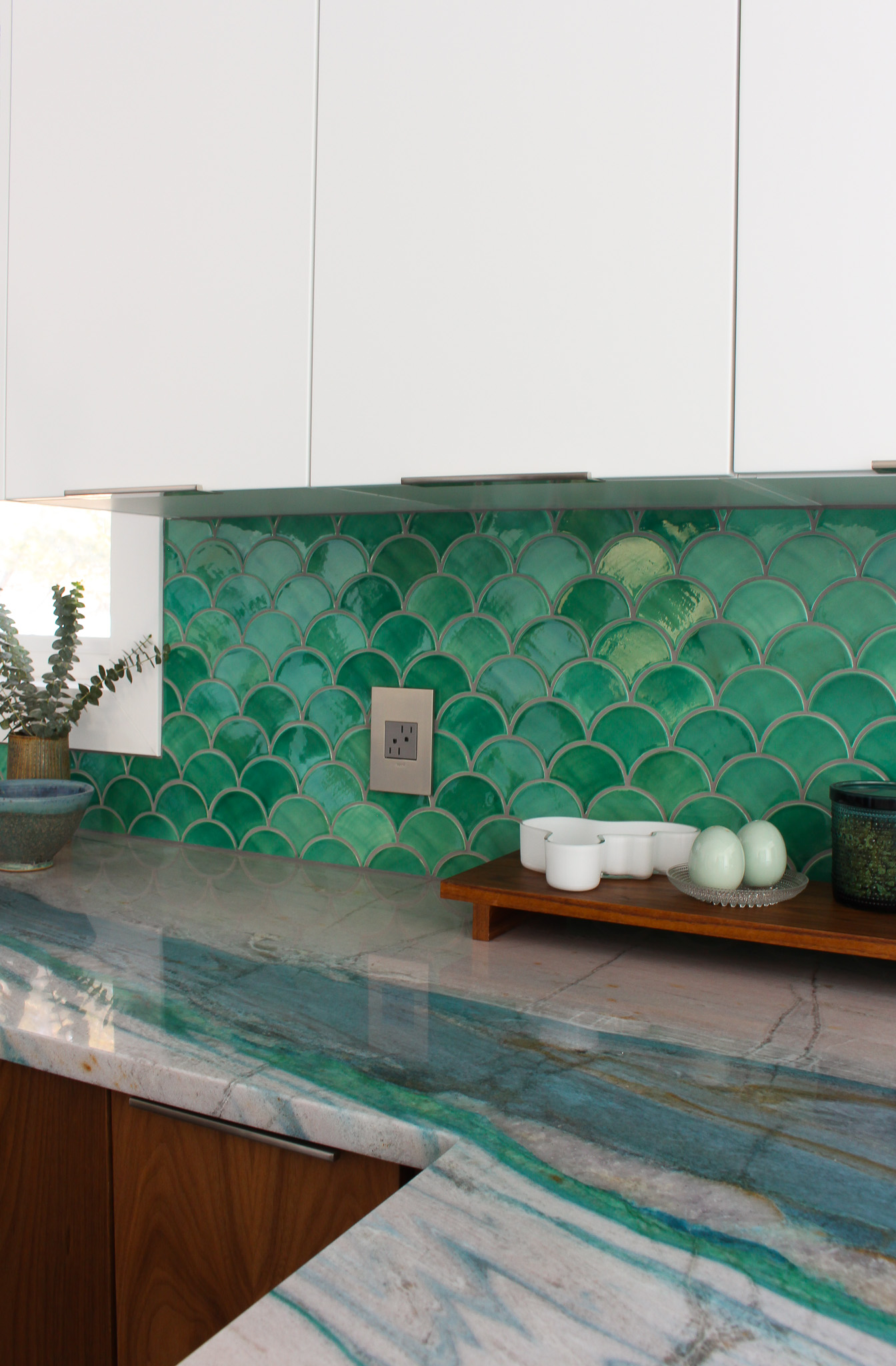
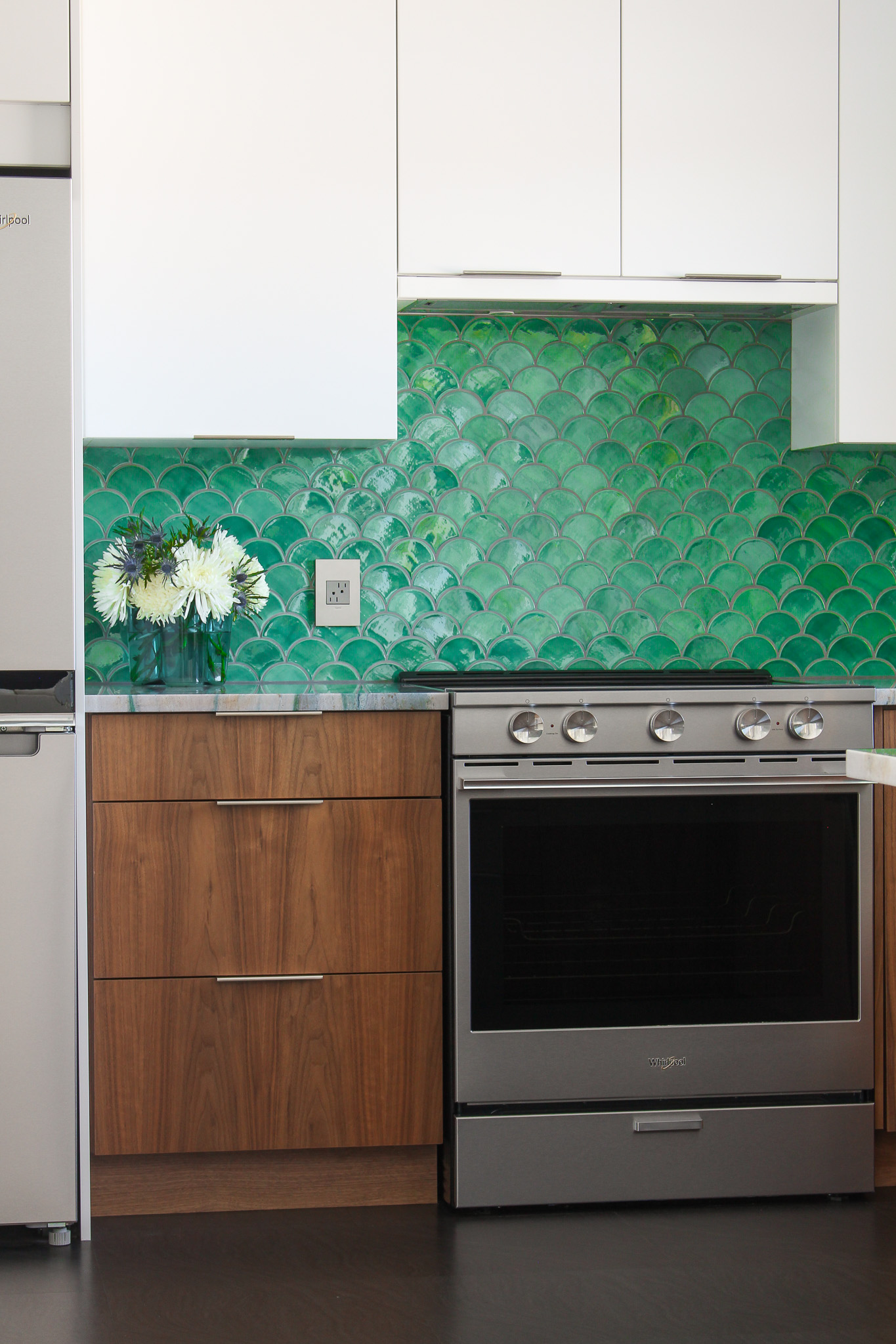
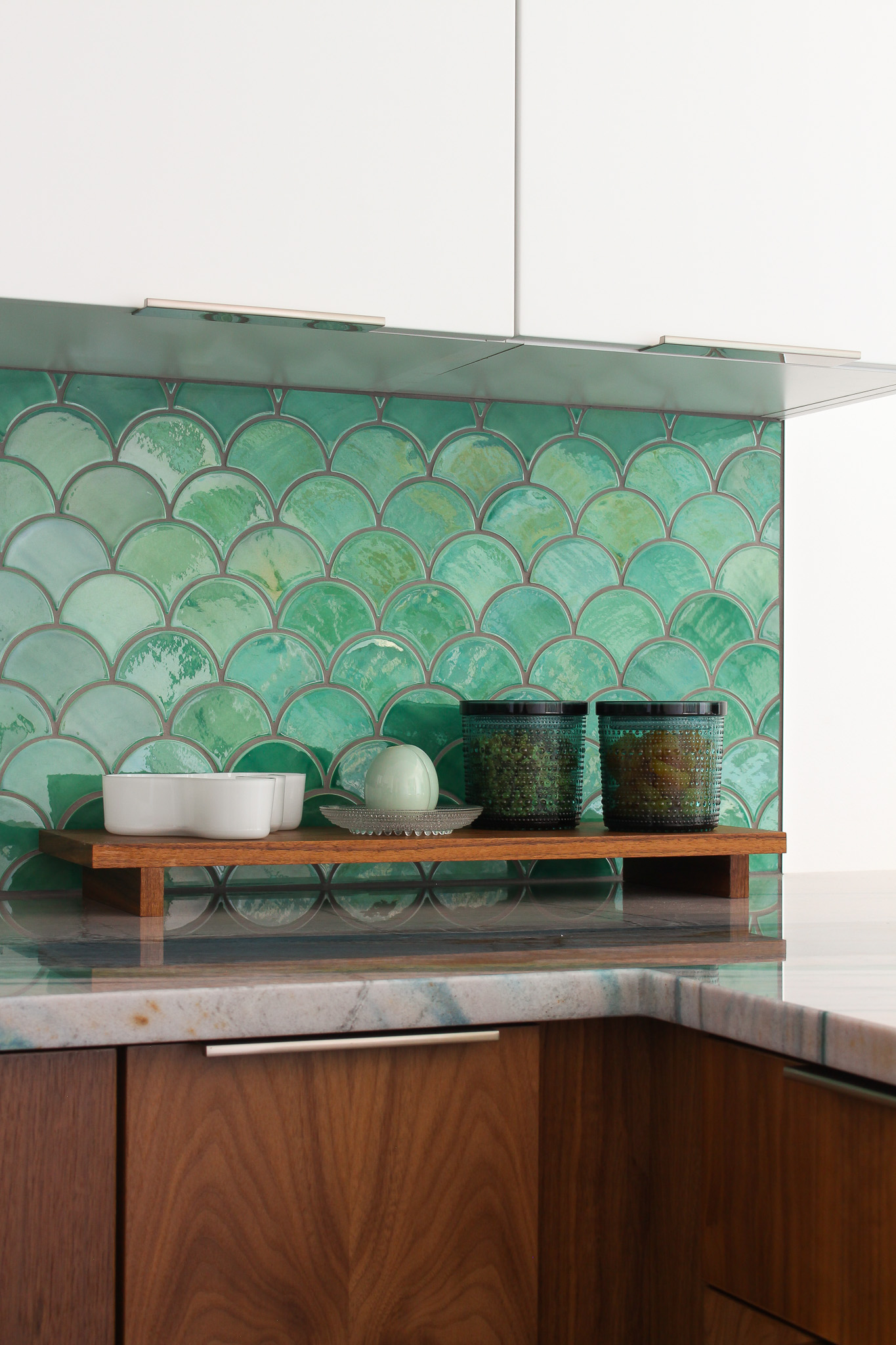
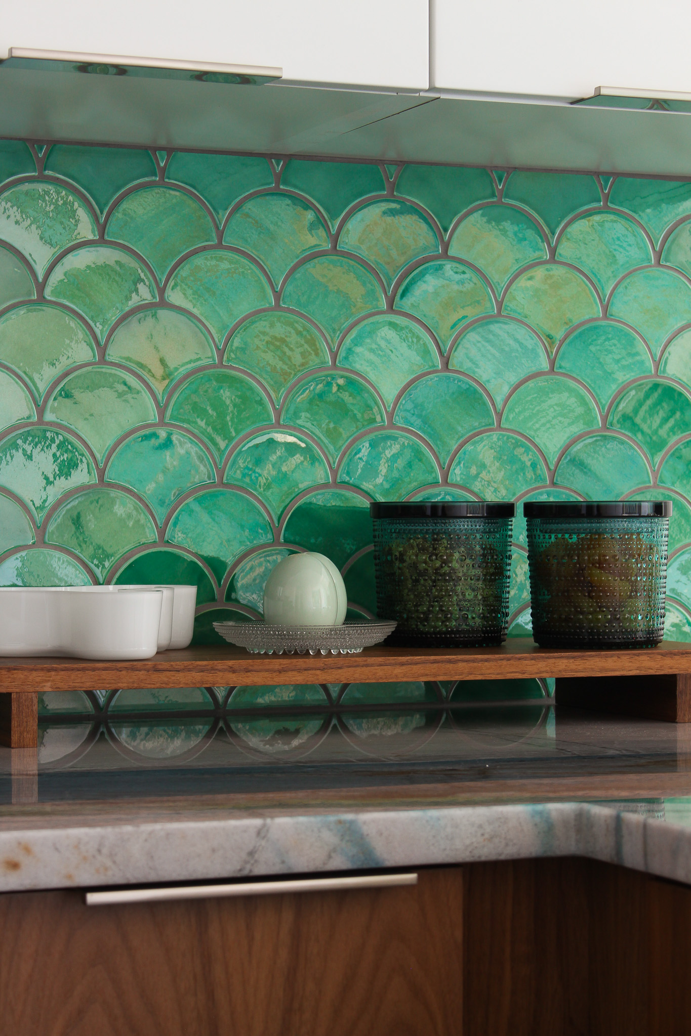
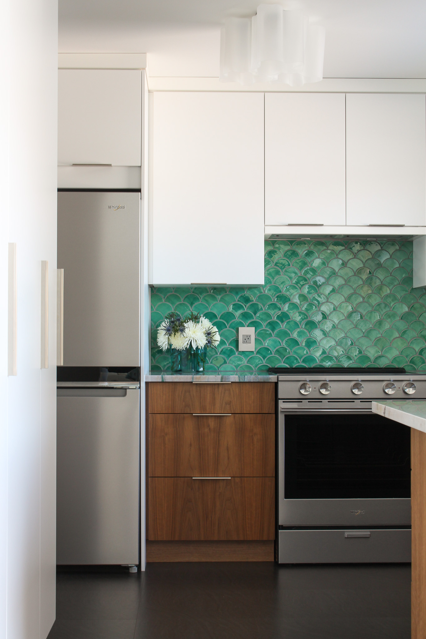
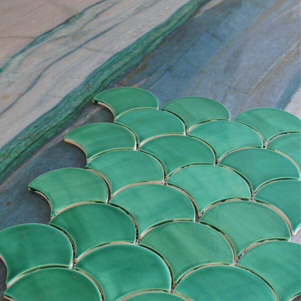
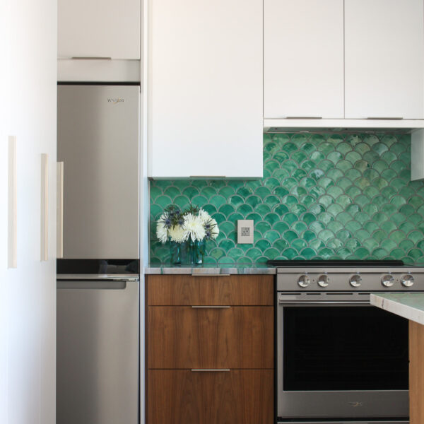
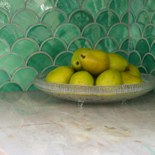
Mercury Mosaics generously provided the backsplash tile, which is their Medium Moroccan Fish Scale tile in 1017E Sea Mist. At first our plan was to tile the backsplash ourselves, but after the nightmare this kitchen renovation turned out to be, I honestly could not find the motivation – nor the confidence, if I’m being honest. After the STRUGGLE to get the counters replaced, I didn’t want to ruin the very last step of this kitchen renovation. So we hired a professional to install the tile and I’m so glad, because he did a beautiful job – and confessed to me that it was a little challenging to install this tile. Because it’s handmade and each piece was so unique, he had to be really careful with the placement of the tiles. I did save him a step and seal the tile myself (I’ll share a blog post about that process later) but I’m grateful I found someone to install it because at this point my nerves were shot. I was in the midst of trying (unsuccessfully) to get my deposit back from the original stone fabricator and I was so stressssed.
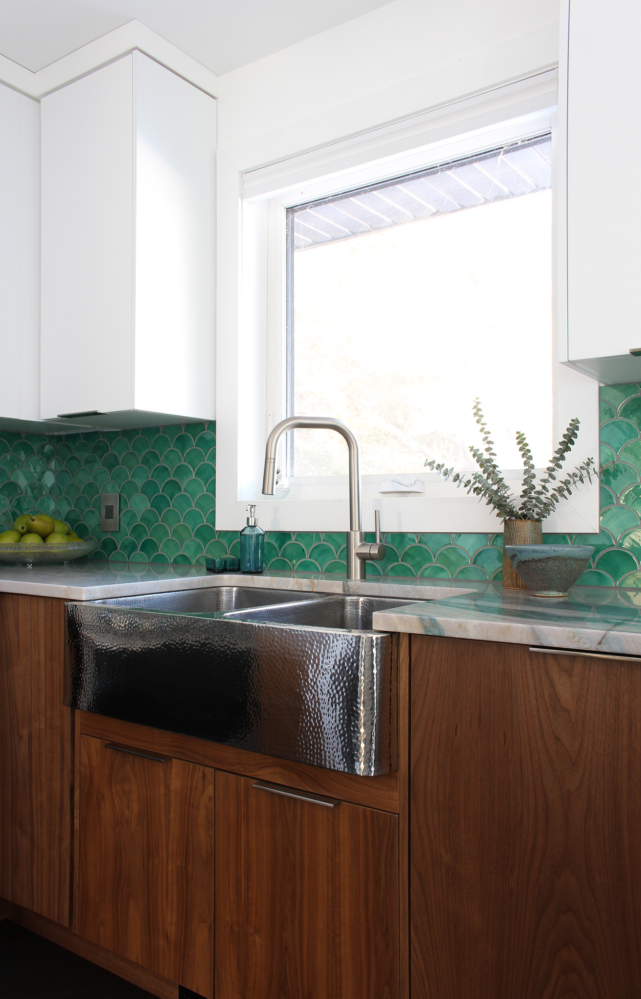
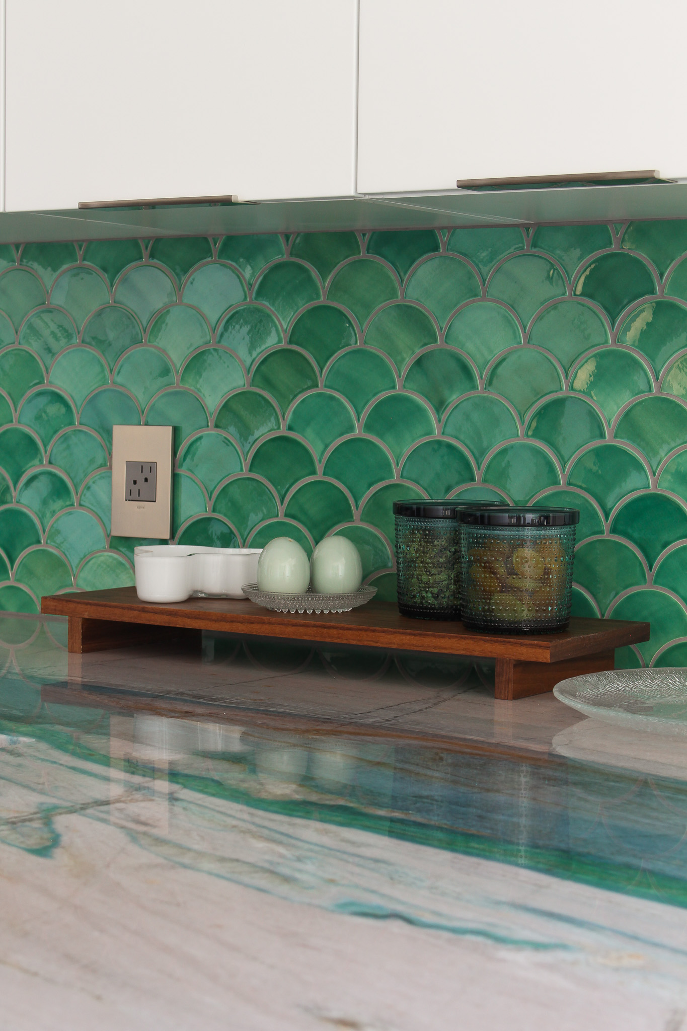
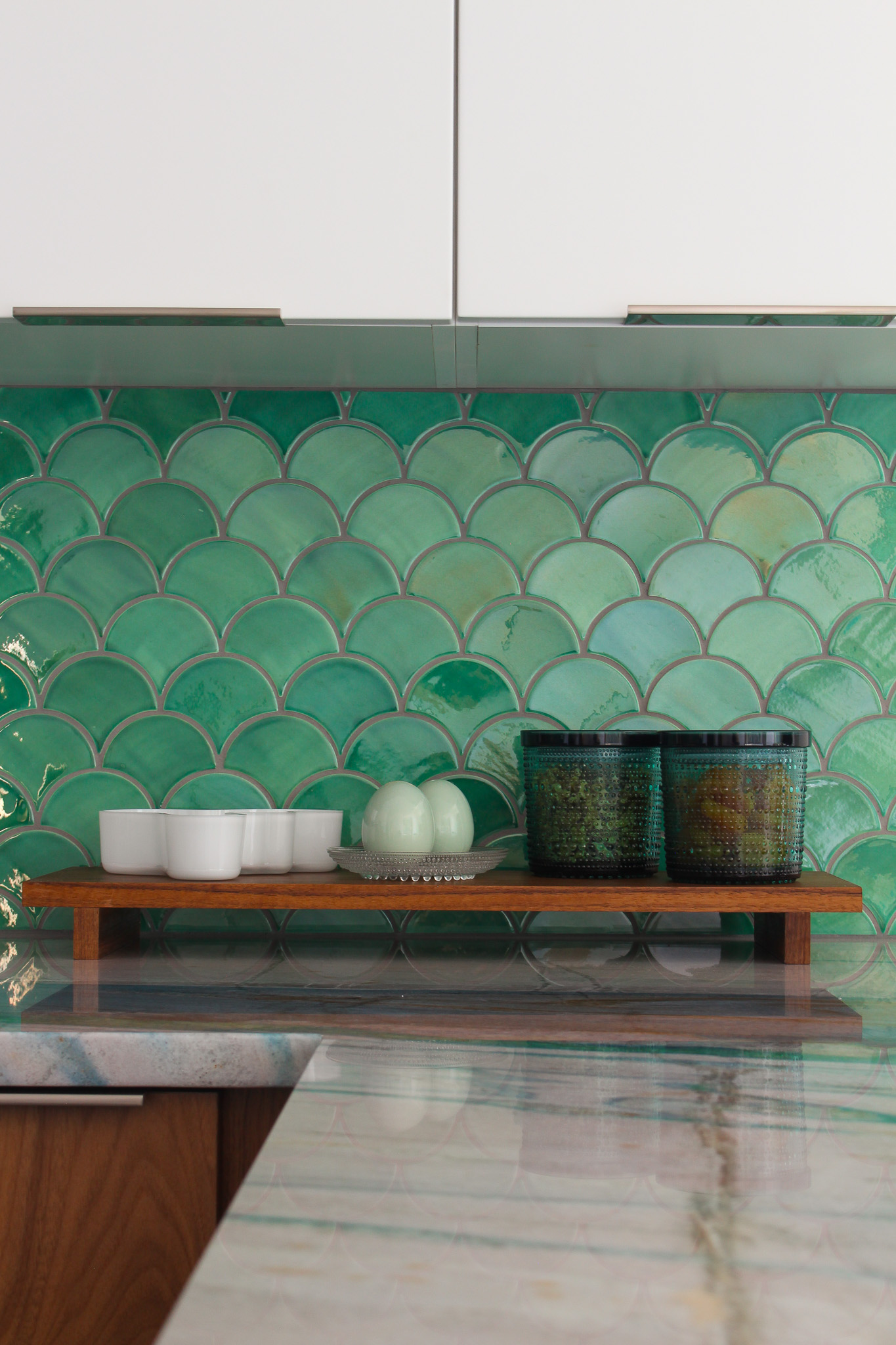
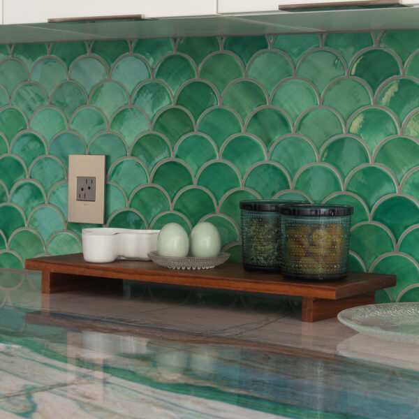
This blue-ish green color (Mercury Mosaics says it’s a: “slightly textured blue-green jewel-toned glaze with a glossy crackle finish and high variation”) is a beautiful match to a prominent green vein in the stone counters. There are so many gorgeous shades of teal, green, and blue in this Portomare Quartzite that it was challenging to find the right backsplash, but Mercury Mosaics had so many beautifully saturated colors to choose from. The glaze changes in the light and creates this shimmering, undulating effect that complements the same luminous quality in the stone and also reflects the changing moods of Lake Superrior, seen through our windows.
The Low Contrast Grout Choice
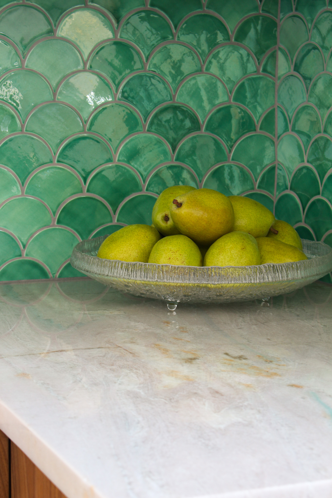
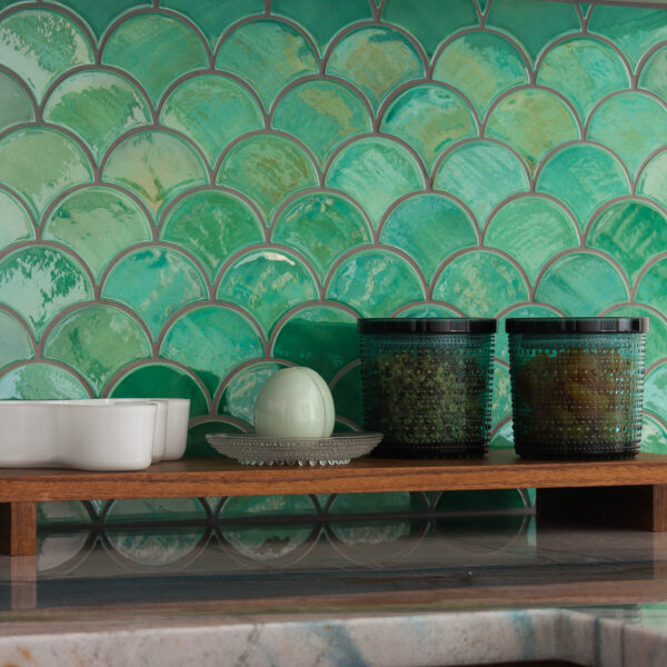
I opted for a medium grey grout, as opposed to white or charcoal grey (my other two options), for a less graphic look. Instead of reading as a bold pattern, as it would have with a high contrast grout, the Moroccan/fish scale shape feels quieter with the more subtle grout. There’s less of a pattern, and more of an organic flow, that complements not only the other kitchen design choices and the counter, but also the rest of the house and the lake inspired paintings in the adjacent open concept living and dining room spaces (see those spaces here).
The Thompson Traders Quiroga Hammered Stainless Steel Double Sink
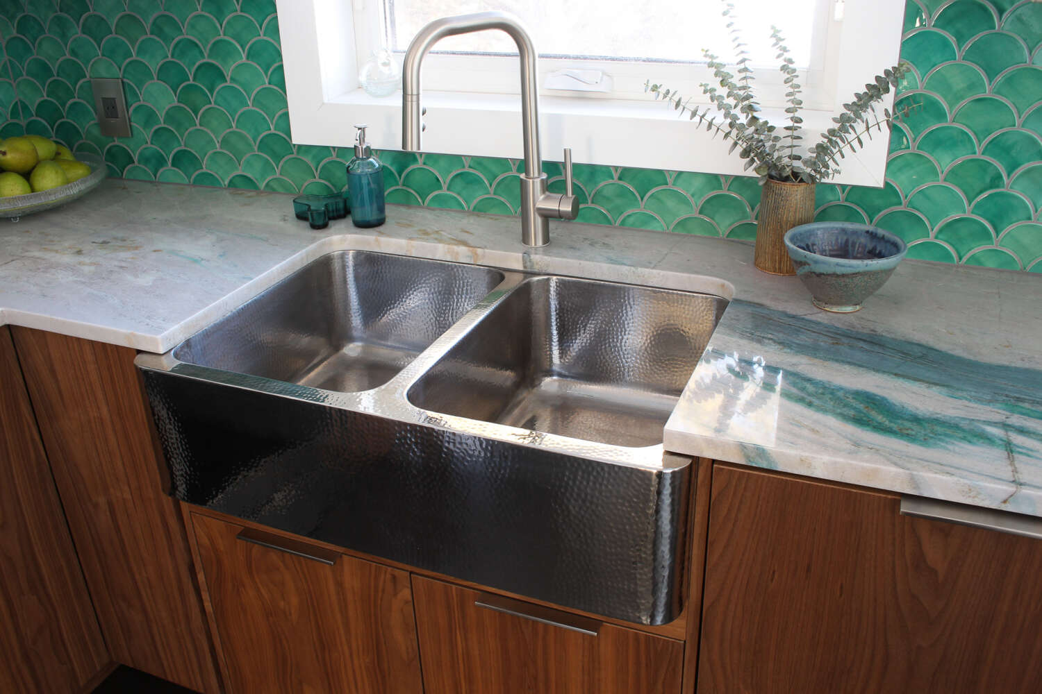
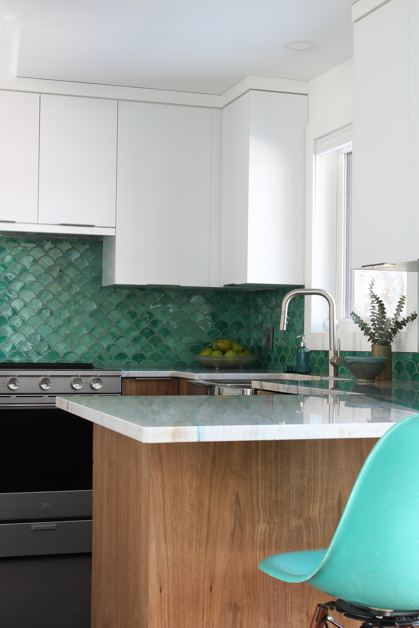
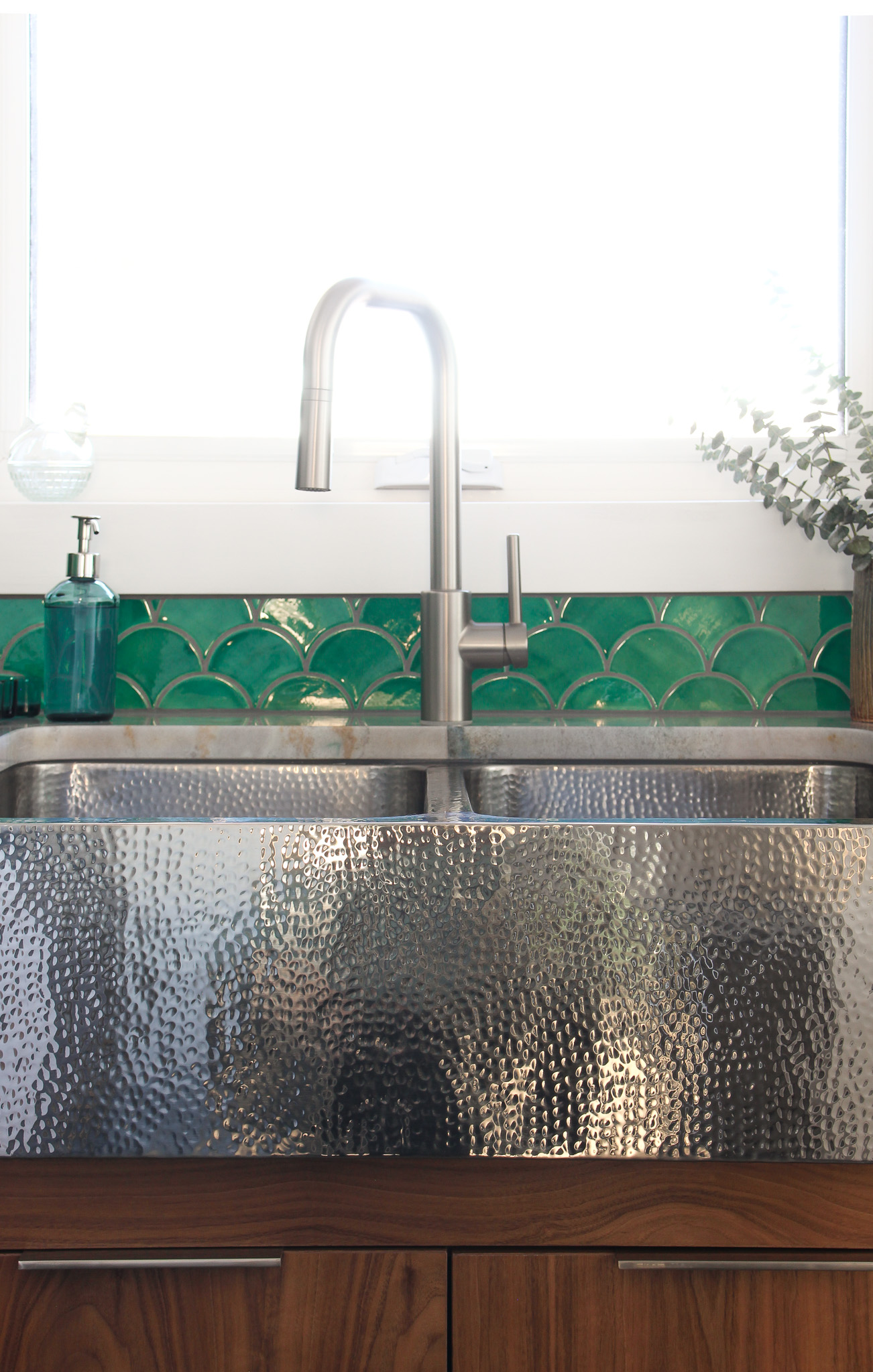
This poor sink was done an injustice the first time the counters were installed. But this time around, the counters hug the curves of this striking farmhouse sink (provided by Thompson Traders). After using it now, for more than a year, I love it as much as when it was first installed. I really like how it complements the copper Thomspon Traders sink we have in the half bathroom, and how it brings more sparkle into this space. The backsplash is very luminous, and the counters have a sparkle and glow – both of which are complemented by the shimmery finish of this hammered sink. I think a plain sink would have been too bland and utilitarian, but this hammered sink complements the other finishes. I can confirm that it does indeed make washing dishes slightly more fun.
The Pfister Zanna Pull Down Kitchen Faucet
I had a different faucet, at first, but when the stone was replaced I also replaced the faucet with this Pfister Zanna Pull Down faucet. I didn’t like the quality of the other faucet and when I started to look for something new, I was drawn to this one because the shape mirrors the soft squared off shape of the sink. On its own, this faucet has a very sleek look and it’s got a more unique shape than your typical faucet – but I especially love how the faucet and sink coordinate. I also appreciate the convenience of a pull down sprayer, which became a must-have for me when we first did our little DIY kitchen update.

The Walnut + White Cabinetry
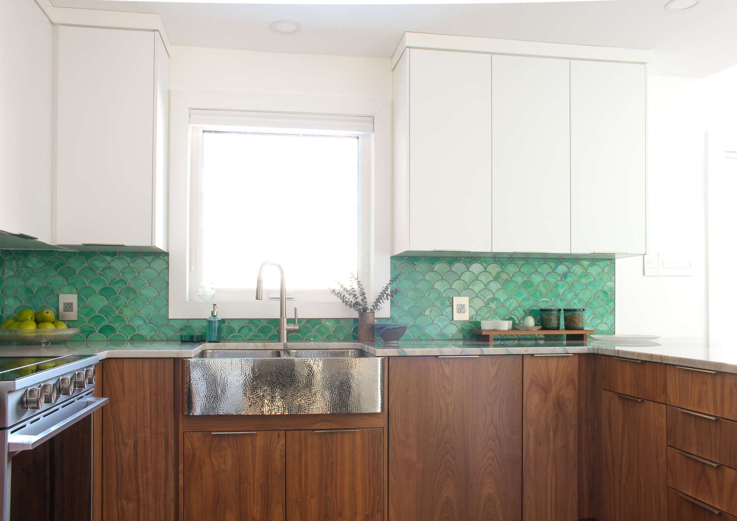
Ever since renovating the bathroom with simple, sleek walnut cabinets, I have wanted the same cabinetry in the kitchen. Unfortunately, even being adjacent to the 13 foot tall wall of windows in the open concept living/dining rooms, this kitchen sometimes feels a little dark. Maybe because the ceiling drops to regular height here? Maybe because of the MASSIVE tree outside the only kitchen window? Whatever the reason, I always knew I wanted white upper cabinets to keep the space feeling light and bright. It’s a small kitchen, and the white upper cabinets and pantry cabinets help the space feel taller and more cohesive with the all white walls every where.
Bringing the cabinets to the ceiling was a must-have, for extra storage and also because I hate dusting the tops of cabinets.
The Wider Kitchen Footprint
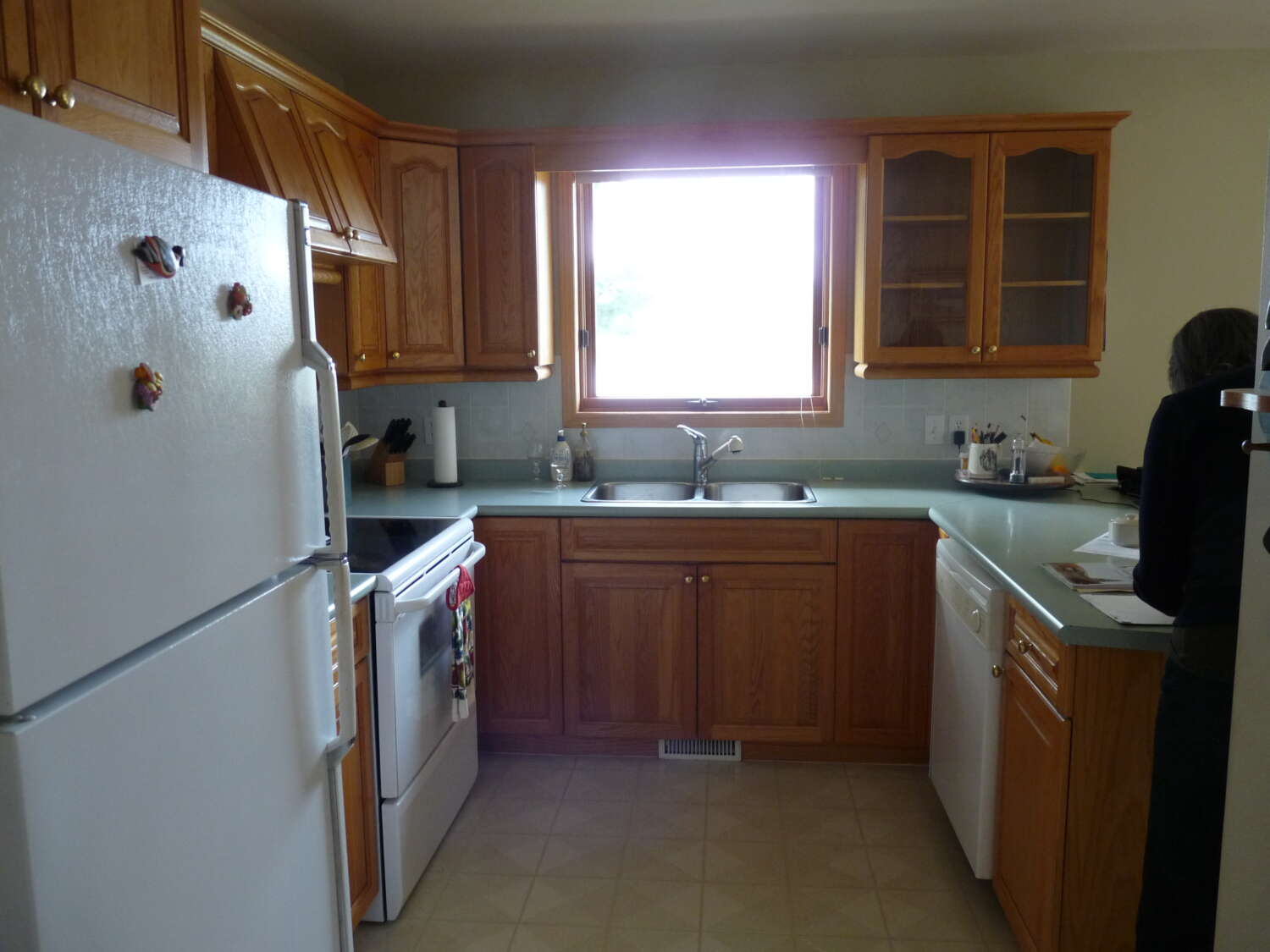
You might also notice that the kitchen is wider now! Before, on either side of the sink there was only room for a corner cabinet. Now there’s room for a dishwasher! And in exchange for only 1 foot of peninsula, we were able to built an entire wall of cabinetry across from the peninsula. This floor to ceiling pantry has been AMAZING! I have so much more storage space now and I don’t ever miss the little bit of counter that we sacrificed.
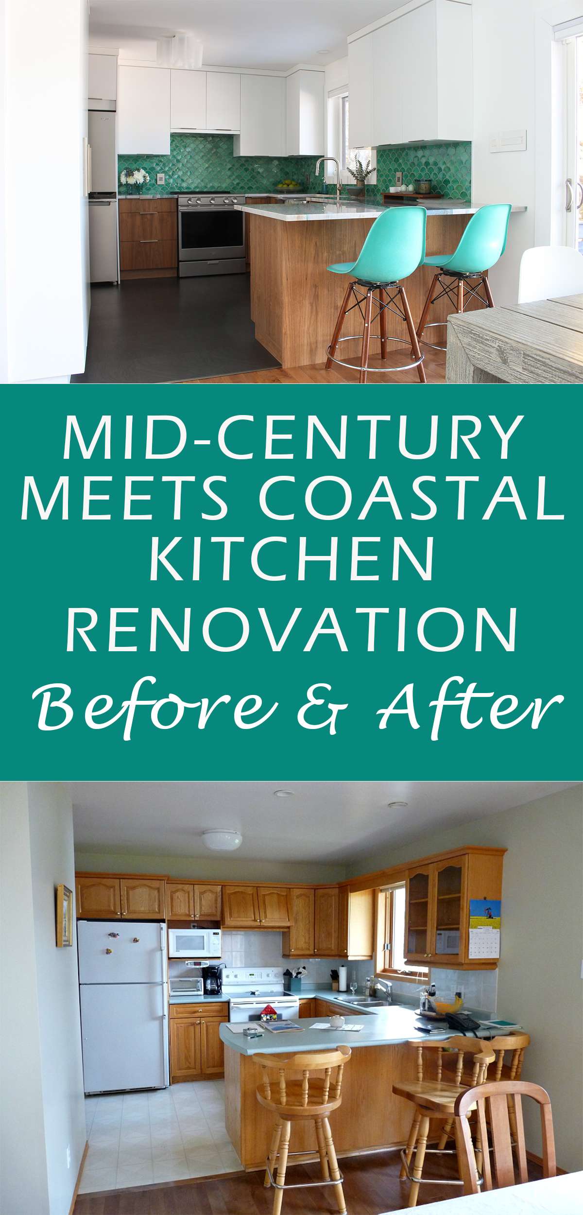
Here’s a reminder of the original BEFORE:
Below are some photos of the “before,” and you can see how much wider the kitchen is – and how much storage we added by adding the pantry wall:


The Whirlpool Appliances
When we first started appliance shopping, we were more concerned about the fridge than stove. We thought we wanted a fridge with a freezer on the bottom, but quickly realized we HATED the freezer drawers. They felt like bottomless pits. Once we found a sleek and modern four door fridge, with freezer on the bottom, we were smitten! It is so easy to access everything and the four doors are perfect for the fridge location (there is a wall across from it, so it’s a smaller space still). The fridge only came in stainless, and we found a Whirlpool brand stove that doesn’t technically “match” (there is no matching stove) but the finish and overall shape/aesthetic was the same.
The dishwasher is the Bosch 200 Series panel-ready dishwasher, so it’s hidden behind a cabinet door that matches the rest of the cabinetry. I really like how it’s hidden. If I had the money, I’d probably have hidden every appliance.
The Artemide Logico Mini Triple Nested Ceiling Light
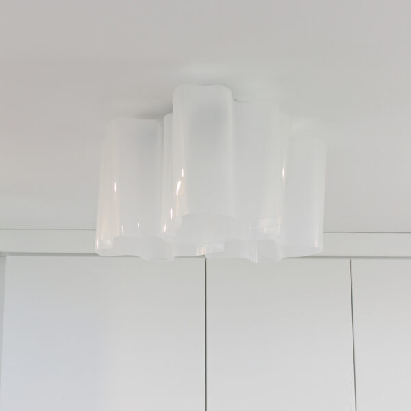
I am still thrilled with my lighting choices: we added two new pot lights and then this STUNNING, sculptural light fixture. I’ll admit, I mostly use the pot lights – they’re so bright, I don’t even need the original overhead light. But, it’s stunning even when not in use – it’s like a ceiling sculpture and I’m 100% okay with that!
The Emtek Modern Edge Pull Cabinet Hardware
After choosing the squared off, modern fridge and stove, I started to eye up more squared off and modern hardware. I wanted something in a silver finish, with lots of size variations because I wanted larger pulls for the big pantry doors. The Emtek Modern Edge pull (provided by Emtek) was perfect, because it’s available in 6 finishes and 7 sizes! I chose the satin nickel and used the same handle on everything: the upper cabinets, lower cabinets – even the dishwasher! I installed it vertically, in a larger size, on the pantry doors (see above photo). They’re so easy to use and grab, but have a sleek look – I’m so happy with them! And, importantly, the finish still looks brand new after over a year of use.

The Luxury Vinyl Tile
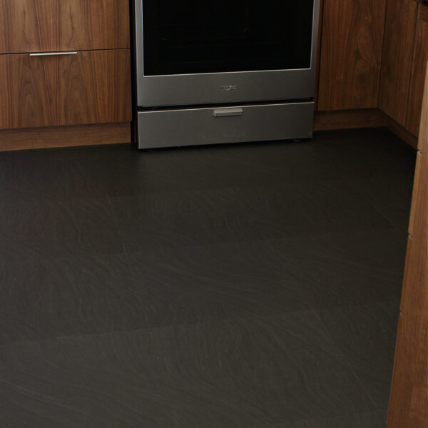
End of the Roll provided the luxury vinyl tile flooring and it was installed early on in the kitchen reno progress. After more than a year of use, this floor has held up SO well – even against dog nails and tools that scraped against it during the renovation progress. I really don’t like grout, and the dogs DESTROY wood, so short of flooding the house with concrete (tempting), this was the best option for the wear that this space sees. The flooring in this room flows into the entryway, laundry room and powder room – the wettest and most hardworking spaces in the entire house. The major selling point, though, was that it looks exactly like the black sand on a nearby beach…

The Kitchen Decor + Accessories
This kitchen, despite being so much larger now, would probably still be classified as “small” to most people, so I have very minimal accessories on the counters. Partly to keep the surfaces clear for cooking, but also partly because I don’t want to cover up ONE INCH of that beautiful stone. I don’t even have a kettle, toaster, or kitchen utensils out on the counters, because I have so much cabinet space now that every single thing has a home – and it’s WONDERFUL. I did, however, add a stunning Iittala Ultima Thule footed centerpiece bowl for fruit (gifted by FinnStyle). This ties in the Iittala Festivo candle stick collection in the dining room.
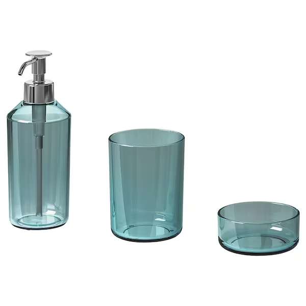
I found the cutest teal glass soap dispenser at IKEA and the rest of the pieces (Iittala Alvar Aalto sea blue dish, pottery bowl, and pottery vase) are secondhand finds. I just wanted to add a little bit of color and some more organic textures through the accessories, while keeping it functional.
I wanted a little walnut riser, so we made one from scrap wood leftover from when we made our DIY nightstands with drawers. I topped it with another Alvar Aalto Iittala dish I’ve had forever, plus a pair of Iittala Kastahelmi containers in sea blue as well as my thrifted egg shaped salt and pepper shakers. For photos, I added my Alvar Aalto vase, but usually it lives in the living room.
My Design Inspiration
I am thrilled with how this kitchen reno turned out! I sure feel like I had to work for it, though. I am not a patient person, so 6+ months of waiting for these stone counters – TWICE – really tested me. It was also really difficult to get my deposit back from the original fabricator – it came to me in instalments, months apart, that I had to really fight for. But in the end, it was worth it because this space is so perfect. I love the end result – it’s uplifting being in here! Although I changed a few things, I stayed pretty true to my original design plans (which you can see here).
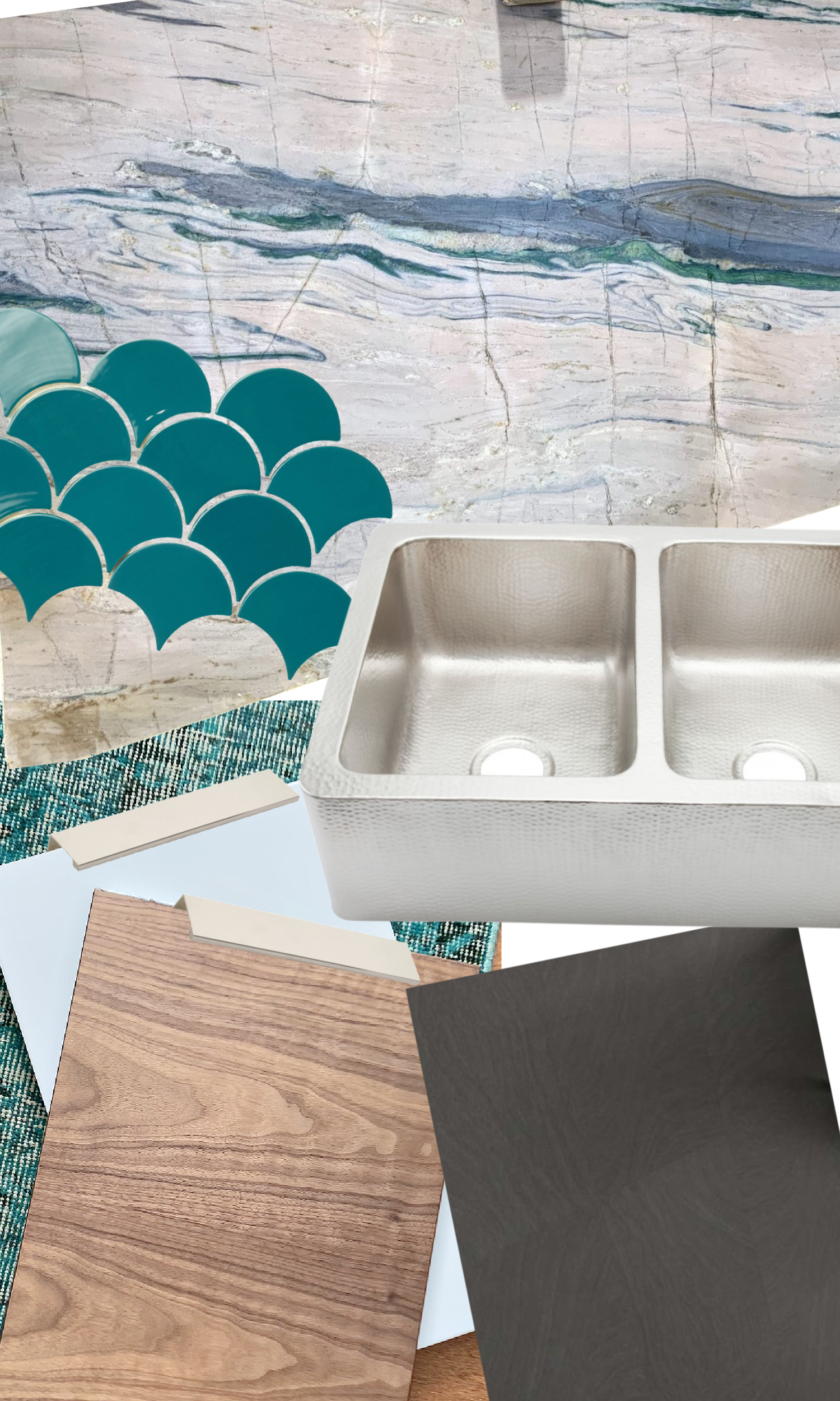
I was inspired by where I live, sandwiched between Lake Superior and deep, lush forest, to incorporate a lot of natural, organic elements. From the scallop shaped tiles (waves!) to the walnut grain on the cabinets, I wanted to have a lot of beautiful textures to reflect our surroundings, punctuated by my love of cools blues and greens. I think the kitchen flows well with the rest of the house, and complements the other renovations we’ve done over the years. My mid-century meets coastal style really came through in this renovation.
Thank you so much for joining me on this renovation journey – it was so helpful to have thousands upon thousands of people tell me to send back those counters. I’m sorry this dragged on for so long – and now you’ll have to wait some more for me to update the stools. But sometimes that’s how the cookie crumbles with renovations…
Sources:
- Tile: Mercury Mosaics
- Counters: Portomare Quartzite
- Walnut Riser: DIY
- Sink: Thompson Traders
- Fridge/Stove: Whirlpool
- Teal Soap Dispenser: IKEA
- Flooring: End of the Roll
- Faucet: Amazon
- Light: Amazon
- Jars: Iittala Kastehelmi
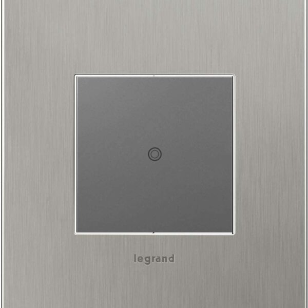
- Stainless Wall Plates: Amazon
- Cabinet Pulls: Emtek
- White Dish: Iittala
- Fruit Bowl: FinnStyle
- Counter Stools: Modernica
P.S. Don’t Forget to Pin for Later!


We never finish projects all the way here. 😉 So I think it’s PERFECTION! Dreamy! Love how the counters look and that sink, of course, makes me Greensboro proud!!!!
Author
Thank you!! It’s the last little bit of projects that are always the worst, lol. We are (almost) sink twins! I love your gold one so much.
No words for those counters! Well, gorgeous, stunning, and so you. My imagination did not do your backsplash justice; they are so perfect. Your colors are my colors, so I would just stare at everything all day too! Really glad for you that you stuck it out and worked at making it happen. (it must help the winter pass by too).
Author
Thank you!! I DO spend a lot of time indoors, so I appreciate that this space is now (mostly) complete, and also larger and more functional. The added space means two of us can comfortably work in here now. I’m really grateful I could get the stone in and see my vision to the end. That has felt really satisfying!
One of the most beautiful color combinations I have seen for a kitchen!
I would smile every time I walked in there.
Thanks for sharing, sorry it took so long with all the problems you had.
Author
Thank you so much! I can say now, with everything behind me, it definitely does make me smile. I spend way too much time admiring the counters and sometimes get distracted while cooking, lol.
Love it!!!!!
Author
Thank you so much!
So happy for you!! It is just beautiful.
Author
Thank you so much! It feels so nice to have this space completed 🙂 I have been so excited to share it!
If I had a sink like yours I would commit to handwashing, over a dishwasher for the rest of my life. I just love it. I have not seen one like that here in Australia. If they come here, hang the cost.
Author
It definitely does make washing dishes infinitely more enjoyable!
The kitchen is beautiful Tanya! Thank you for sharing. The mermaid scale (if they have scales) back splash is fun and completes that seaside feel.
Author
Thank you so much!
At first I wasn’t keen on the backsplash tile, but I was wrong and can totally see what you envisoned. It’s beautiful with the slab counter.
I really dislike the drawer freezer also. Right now I have a freezer up top which isn’t much better. Do the freezer doors have storage? I looked up a 4 door Whirlpool with freezer on the bottom and didn’t see any door storage. If yours is similar, do you miss this in your new freezer?
Author
Thank you 🙂 This freezer does not have door storage, but inside there are drawers. It’s easy to organize, but you can’t fit anything large in here easily. I don’t eat meat, but if I needed to freeze a giant turkey I’d be in trouble, lol. But personally, I love it. It’s so much easier to access everything now and fridge on the top is the best! I don’t miss the door storage at all.
I’m at work surfing around your blog from my new phone! Just wanted to say I love reading through your blog and look forward to all your posts.
In the last couple of months I’ve seen three kitchen reno’s of friends/neighbour. They were all the same – white cabinets and that white quartz/quartz-like material with the grey or beige veining – they put it on everything – floor, counter, backsplash. Its the current template. But this is such a nice change, it has personality and warmth, which those renos do not. This is lovely.
Author
Thank you so much 🙂 I think people can be afraid to commit, they’re worried their tastes will change, or the trends will change, so they choose something they think is timeless (probably also hoping it will net a profit during resale). All white is very safe. I think it can also be beautiful, don’t get me wrong. But I’ve become very confident in my style and taste and that’s allowed me to renovate more freely.
The countertop and backsplash combination here is genius! I love how the blue-greenish veins just seem to flow from the backsplash. Also, I totally agree with taking the cabinets to the ceiling! The amount of nasty/greasy dust that accumulates on the top of kitchen counters can be disturbing lol. Awesome job, enjoy it =)
Author
Thank you so much for your kind compliments 🙂 And yes, to the ceiling cabinets are the best! Extra storage and one less thing to clean…
I’m at a loss for words. Your kitchen renovation is stunning.
Author
Thank you so much! I keep pinching myself, I can’t believe it’s finally done haha 🙂
Hello!! I just showed my husband this post.. he needs to see transformation to believe that it’s possible. What a magnificent job! We’re hoping to create our own little MCM paradise here in Penticton. I’m so glad it eventually worked out with your counters!
Author
Thank you so much! I’m so thrilled with it – and the fact that it’s done, lol! Wishing you all the best for creating your MCM dream – I hope your renos will go smoothly 🙂