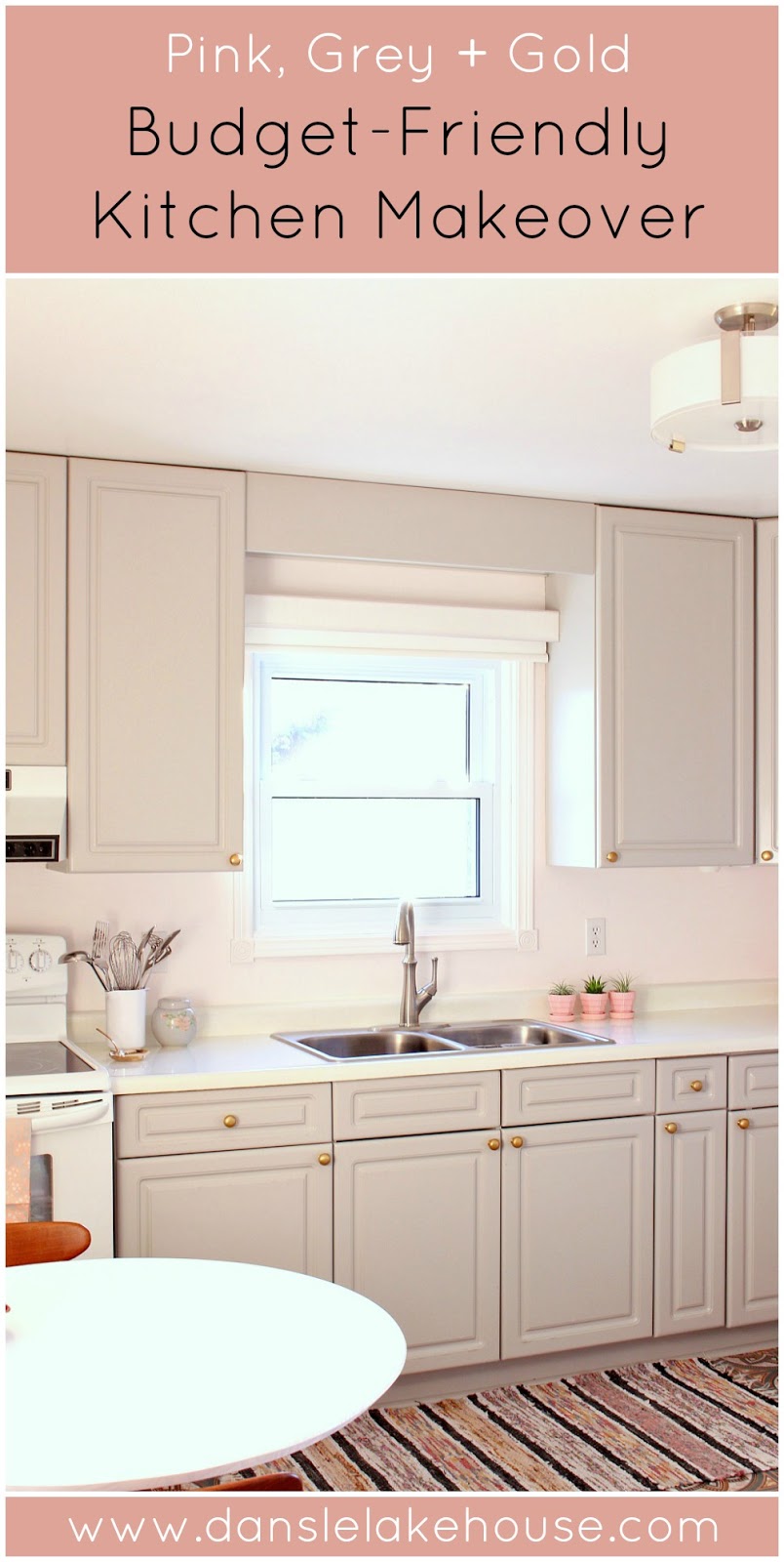
Time to show you the DIY budget-friendly kitchen makeover we did at my Mom’s place! It is so full of really easy fixes and easy-on-the-wallet DIY projects.

We ran into some small problems along the way, like backsplash tile which never showed up and peel and stick flooring which refuses to stay stuck. Mom has this weird aversion to backsplash tile, so she was thrilled by the former problem – but kind of bummed by the latter. There’s also still a little more we’d like to do in here: after 20+ years, my Dad finally installed the under cabinet lighting but we still need to paint and install the corresponding trim. We’d also like to add more art above the coffee station and we’re on the hunt for the perfect rug – although my Mom had a cute rag rug already that works well for now.

These little details will be ironed out over the months to come because Mom and I are both fans of slow (read: we’re broke) design, but I didn’t want to make you wait any longer because I’ve teased you with this DIY budget-friendly kitchen makeover since the summer!
So let’s get to it!
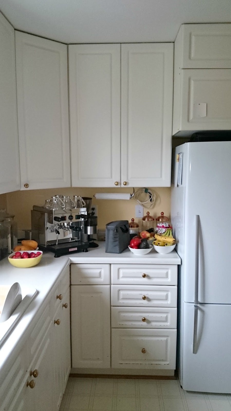
Here’s a look at the before:
Mom’s kitchen, which she renovated in the 1980s, looked super cute at one time, with a light and bright mint green, peach and white color combo. She really made the best of a small, dark kitchen on a budget – a classic, all white kitchen still looks good today. But the wallpaper had long ago peeled off the walls, the vinyl flooring was discolored from the glue, the laminate counters were chipped, and the melamine cabinets had started to bubble (one reason I avoid melamine like the plague). Her light fixture was missing (long story), the faucet was dented (an even longer story), and the fluorescent light fixture about the sink was just a naked bulb. Plus it was SO cluttered and messy, because it’s difficult to care about keeping a space orderly when it looks shabby. Mom was always complaining about a lack of counter space to actually cook in here, plus a too large dining table – the only space to eat in the house – really made the kitchen cramped.
The kitchen is really in need of a major reno, but that’s not in the cards for my parents right now, so Mom and I rolled up our sleeves and made magic happen with a DIY budget-friendly kitchen makeover. There’s nothing a little paint, elbow grease, and de-cluttering can’t fix!
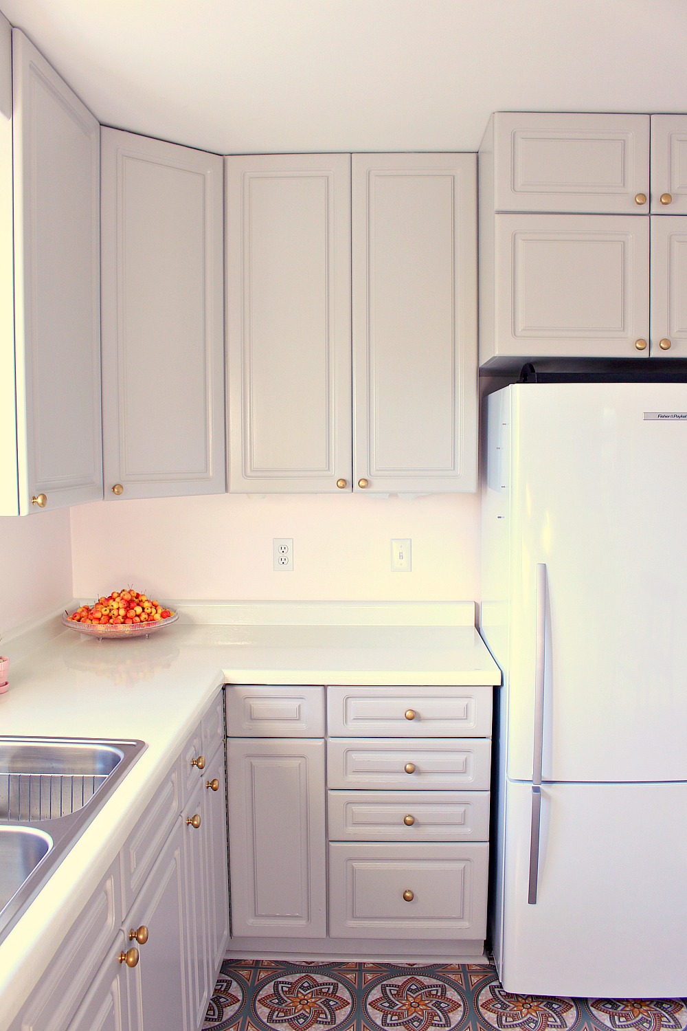
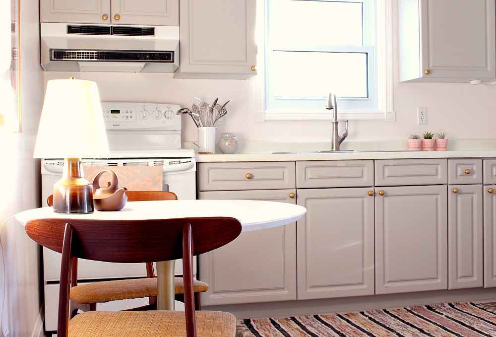
Here’s a look at the kitchen today:

Pictures don’t accurately capture how cozy and fresh this kitchen feels now – it just glows, thanks to the soft pink walls and touches of brushed gold. Here’s a closer look at everything we did:
The Painted Melamine Cabinets:
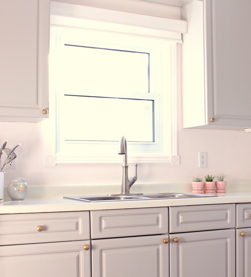
The first thing we did in this budget-friendly kitchen makeover was paint the melamine kitchen cabinets with Rust-Oleum’s Cabinet Transformations Kit (in Winter Fog, un-glazed) which adheres SO well – even on melamine – with no sanding required. If you look close, you can still see some flaws where the melamine was bubbling, but it looks so much better than before! It’s also a great way for Mom to experiment with a darker cabinet color, something she’s been contemplating for the real reno. I took photos in different lighting conditions, and you can see how sometimes it reads more pink and sometimes more golden – it’s such a pretty wall color/cabinetry combo.
The Pale Pink Walls:
We painted the yellow walls a soft pink (Behr’s Shea) because out of all of the paint swatches we considered (numbering in the hundreds, I’m sure), this soft pink looked the freshest and cheeriest under all lighting conditions. It really brightened the room – even more than white – which was essential for this dark kitchen. We replaced the baseboard because we found baseboard identical to the to 1950s baseboard elsewhere in the house, but we left the door and window trim. After an afternoon of caulking (my favorite job), we painted out the trim to match the walls for a seamless look. Just wall paint and new trim paint this the space feel 100x fresher.

The Refinished Laminate Counters:
To keep things bright, we refinished Mom’s laminate counters in a glittering white! They were in really rough shape, with chips, stains, and missing pieces. The laminate was even de-laminating from the MDF base. Click here for the tutorial because I shared some great tips for repairing the laminate counters: we glued back the laminate and where pieces were missing, I built them back up with a mold-able epoxy compound. Then we used Rust-Oleum’s Countertop Transformations Mica (in white) and the counters are now a sparkly white:

It’s difficult to photograph, but they just sparkle like crazy when the sun shines in.
The Refinished Brass Cabinet Hardware:
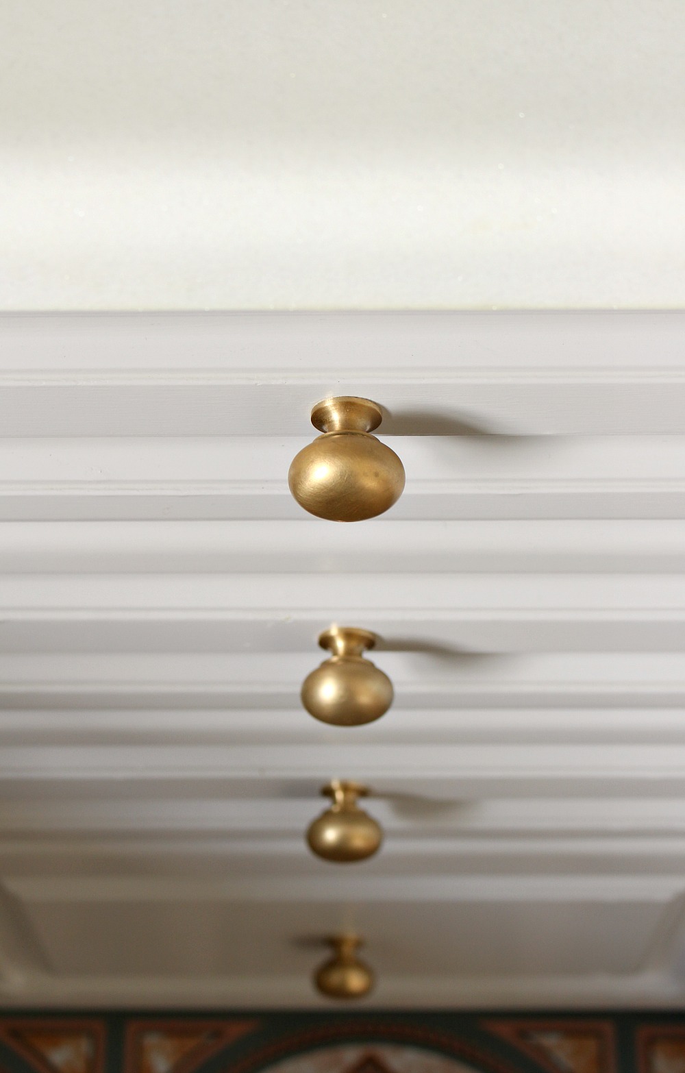
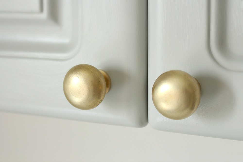
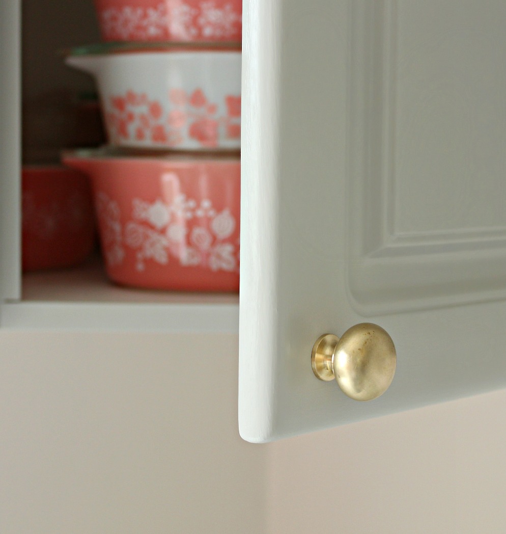
I already shared the tutorial for how we refinished Mom’s shiny brass knobs – they look so fresh with their new brushed brass look. Plus we saved a bundle not having the buy new hardware.
The New Sink + Faucet:
Although we tried to work with what we had for this budget-friendly kitchen makeover, Mom did have to buy a new window (she had to replace all of the windows on the main floor) plus a new sink because her old white acrylic one was just too awful. We picked up an inexpensive stainless sink to complement her new Pfister Tamera faucet, generously provided by Pfister. The faucet is something she can use again when she renovates for real (or she can donate it to me for my fish room makeover!).
The DIY Tulip Table + Art:
Lacking a dining room in the small, post-war home my great-grandfather built, we always ate in the kitchen the way my great-grandparents did. In the 1980s and 90s, we had a small round table with drop down leaves so it could nestle close to the wall. In the 2000s my Mom bought new living room furniture and a dining room table in a much nicer teak wood, but it was a bit too big for daily use. It was challenging to maneuver around it and once Hubby became a permanent fixture, dinner for four was a tight squeeze. I finally encouraged my Mom to move the dining table to the living room, where there is space, and to put a much smaller tulip table in the kitchen for tea time or brunch for two. I already shared the makeover of my old tulip table – and the top my father-in-law helped me hack.
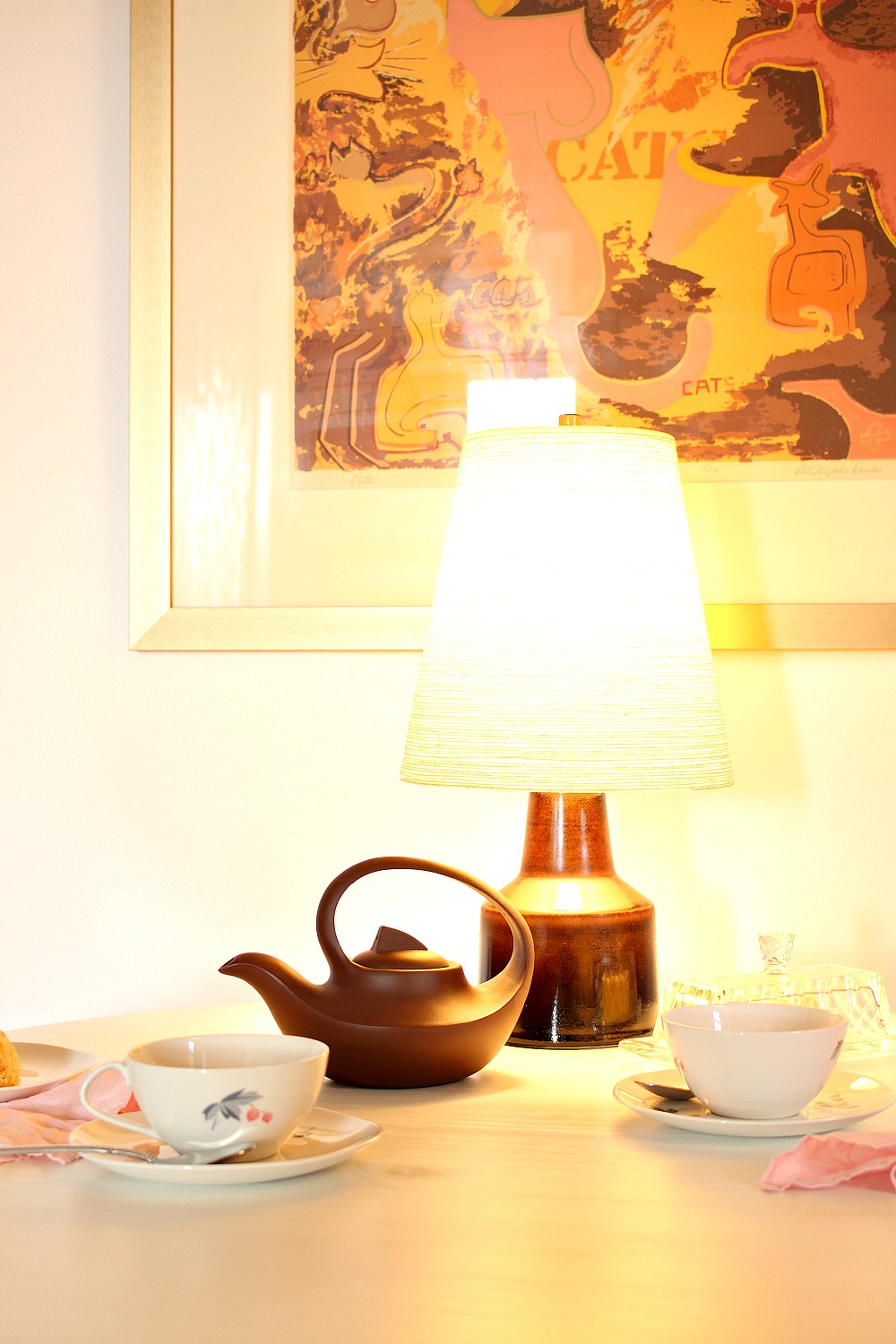
Do you recognize the art? It’s my 1960s cat print from the townhouse! The brushed gold frame, muted pink color palette, and retro vibe are perfect in here.
The Table Top Lamp:
I feel like out of everything in this budget-friendly kitchen makeover, this might need the most explaining? My Mom LOATHES overhead lighting – especially fluorescent lighting – which is why her naked bulb situation made her cringe. Eventually, she started using a lamp at the table so she could turn off the overhead lighting during dinner. When the dining table moved, the lamp moved with it so Mom stole this little brown vintage Lotte lamp from me for the tulip table. The scale is adorable and the retro look is perfect. It might seem odd, but it really is nice to have this little lamp on when I come over for tea and gossip. Even though her overhead lighting situation has greatly improved (with a light fixture – how novel), having this little lamp feels cozy, especially with the days getting so much shorter.
The Coffee Station:
My parents have an elaborate, professional-grade coffee making set up, which they scored for a decent price because they knew someone who owned a coffee shop. It really commandeered my Mom’s minimal kitchen prep space, though. Between the coffee maker and the microwave -and all of the random stuff piled up on the counter – she had no spot to work. I suggested she try living without the microwave (I don’t have one and never, ever miss it), reorganize a little to find room in her cabinets for the dry goods she stored on the counter, and move the coffee stuff to this little cubby (which originally housed the tiny 1950s fridge). All of the coffee stuff is together now – along with a vintage cookie jar picked up for a quarter (my Mummu has the exact same one) – and out of the way. I couldn’t help make my Mom’s kitchen any bigger during this budget-friendly kitchen makeover, but moving the coffee machine and microwave, and de-cluttering a little, have tripled her counter space, making the kitchen way more functional for her.
The Peel and Stick Tile Floor:
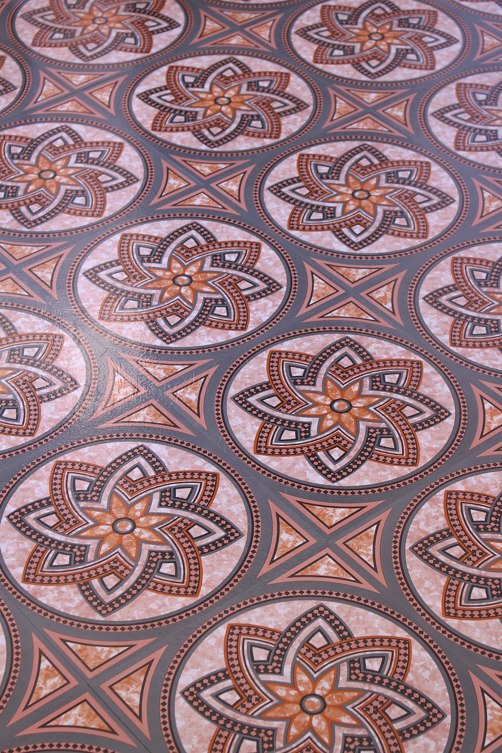
Mom and I were SO excited about this peel and stick tile floor, which brought together all of the colors: the blush pink walls, the grey cabinets, the burnt orange tweed chairs and the warm brown wood tones. But it refuses to stay stuck in some spots! We’re so incredibly frustrated and currently chatting with the distributor but I’m not sure they can fix it. We might need to replace it, which we’re really disappointed about. On the plus side, when Mom tackles a renovation for good, now we know that a busier pattern can work, even though her kitchen is small – we were so terrified to commit to anything not white, because that’s what was there for so long.
The Odds + Sods:
In addition to refinishing the cabinetry, counters, replacing and repairing trim, painting the walls and trim and laying down new flooring, we also did some little things. Mom’s naked bulb ceiling fixture was replaced by a fixture she already had. It had wobbled, so she hadn’t put it up, but Hubby took it apart, fixed it, and it looks perfect! We cut a new sheet of plexi for the fluorescent light fixture and, using a simple bracket, installed that so the light over the sink is no longer a bulb. Her kitchen door was painted grey to match the cabinets and a door knob was finally installed. Hubby and I also built a cute pink and gold dog bowl stand for when Szuka visits.
There you have it – Mom’s DIY budget-friendly kitchen makeover!
Mom is thrilled with how the kitchen looks now and it’s sparked a wave of updates and decluttering in the house – we just found the perfect mid-century mod inspired fabric on clearance, so the living room is getting a refresh too (starting with cute new pillows and sheers).
DIY PROJECTS FOR BUDGET-FRIENDLY KITCHEN MAKEOVER
How to refinish brass hardware
How to hack a pine table top for a mid-century modern tulip base
How to repair and refinish laminate counters
How to make a dog bowl stand on hairpin legs
SOURCES
Wall Color: Behr Shea
Cabinet Paint: Rust-Oleum Cabinet Transformations in Winter Fog
Brush Gold Knobs: DIY (Similar)
Counter Paint: Rust-Oleum Countertop Transformations Mica in White
Faucet: Pfister Tamera Pull Down
Tulip Table: Vintage (Similar)
Teak Chairs: Vintage (Similar)
Gold Tweed Fabric: Fabricland (Similar)
Lotte Lamp: Vintage (Similar)
Cat Print: Vintage
Pink Hairpin Leg Dog Bowl Stand: DIY
Pink McCoy Planters: Vintage (Similar)
Glass Fruit Bowl: Iittala
House Cookie Jar: Vintage (Similar)
Yixing Clay Tea Pot: Similar
Pink Linen Napkins: Similar
Coffee Machine: Pasquini
We found, foraged, and hacked a lot of what went into my Mom’s kitchen, but I tried to track down some accessories with the same retro vibe and gold, grey and pink color palette – including some things we pined for and have bookmarked for the real deal reno, like this INSANELY gorgeous gold flushmount light fixture we can’t stop drooling over:

Huge thanks to Pfister for providing the faucet and Rust-Oleum for providing the Cabinet Transformations and Countertop Transformations kits as well as the spray paint for the tulip table and DIY dog bowl stand!
P.S. Don’t Forget to Pin for Later!










Wow, that's a lot of work! The dining spaces are gorgeous (humans' and Szuka's :))! I'm struggling with counter space issues as well, and can't live without a microwave, so any suggestions would be very much appreciated. Thanks!
Thank you!! Microwaves are tricky but I understand they're necessary sometimes. Can you downgrade to a smaller one? Build it into the cabinetry or on a shelf so it's up higher? Inside a nearby pantry? Replace the range hood with microwave combo (Yellow Brick House did that and I love it). My Mom did a good decluttering inside the cabinets, with me for a second opinion, and we cleared so much space and once other stuff, like the flour, went into cabinets, even if she wanted the microwave back there'd be room. If you want, I'd be happy to look at a photo of your kitchen and brainstorm a little! Tag me on Insta (@danslelakehouse) or feel free to email [email protected]
Oh those are some great ideas, and it's really nice of you to offer to take a look, thanks a lot! 🙂 I hadn't thought of putting it into the pantry. I should try that out after checking if there's sufficient ventilation. We're renting, and the range hood is fixed, so we're quite restricted, sadly, and the kitchen is basically an open kitchenette. When the kitchen is in a photographable state (in some parallel universe, sigh), I'll send you a note. Thanks again, Tanya!
Hope I at least got the gears turning – sometimes someone else says an idea and it randomly makes me think of a different solution that works! I'm still noodling on this, now that I know a little more. You could also try building a sort of cabinet or stand for it to raise it up a little off the counter and create some storage space underneath for food canisters, etc.
If you have an "L" or "U" shaped kitchen, push your microwave into a corner. We did and exchanged unusable space for usable space1
I love love love this !!!!!! Those counter tops are so sparkles!!!!! Nice job and how sweet to do this for your mom 🙂
Thank you!! The counter is such a huge improvement, we're so thrilled.
So sweet for your mom. Also, the link to the tutorial on brass knob refinishing goes to the Behr site.
Oops! I linked to the paint color elsewhere so I must have grabbed that link twice. I've been doing this often, either my mouse is broken or my brain is, lol. I will fix when I'm back at my laptop. Thanks so much for catching that!
wow! what a difference- it's gorgeous!
Thanks Cassie!! Such a fun challenge for me: not a stitch of blue 😉
This is totally gorgeous. I love the way it turned out. It positively glows!
Thank you Staci! I'm happy the photos depict the "glow" – we're obsessed with this paint color, it's sooooo soft and warm.
I love the combination of items and colors. It all flows so nicely and delicately!
Thank you! It was fun for me to work with a warmer color palette and it suits the rest of my Mom's home, which has a lot of warm woodwork, pale grey walls, and warm accent colors.
Oh wow, I really like that! What a difference!
Thanks so much Brenda! It was those little things that made such a difference: replacing broken trim, repairing the busted counter, installing a light, lol. It feels SO fresh now. My Mom is thrilled 🙂
I would have never chosen a shade of pink for the kitchen, but now I'm considering it. You've also given me the courage to try a patterned tile to replace my current white flooring. Love it!
So happy you love it! Thanks for your kind words. This budget-friendly spruce was a great way for us to experiment without stressing too much about the cost and worrying about whether Mom will love it for the long haul. We never thought we'd choose pink for the walls or patterned tile either, lol. Now we're more open minded considering finishes for the real deal reno. But those walls are definitely a keeper – now that the weather is colder and the days are drearier, Mom's kitchen looks so much cozier than every before and I credit that soft, glowing pink.
Great job! Would contact cement work to stick down the tiles? I know it's used to glue edge banding on laminate counter tops, and they always warn to do this carefully because it sticks and sticks hard.
Thank you! That's a great tip – I should try that. The company suggested carpet tape but the tile is so thin, I worried it would show a ridge. A tiny dab of contact cement might do the trick, thanks!
Wow! I followed the link from AT and wow! The article there does not do this justice.Never would have thought of pink for a kitchen but it does look so much nicer than before. Glad to see what some elbow grease can do for a space. Thanks for the links to the tutorials. 🙂
Thank you! So glad you like it. (And welcome! So happy you clicked over). I couldn't capture the full makeover in one pair of photos – the before didn't look too shabby from some angles, but then in some areas you really see the wear. In hindsight, I wish I'd done a video tour of the before and after…
I LOVE this makeover! I saw the link on apartment therapy and had to click through to see the rest.I love that you used such feminine colours, but the room is not at all "little girl". I really want to paint my living room pink but was afraid it would be too much – you've shown me it can totally be done 🙂
Welcome! And thanks for your kind words. It's funny you mention the room being feminine but not girly. There was a point where we considered leaving the chairs with a black and white houndstooth and doing a black and white or faux marble floor, but that – with the pink and grey and gold – felt very young. The muted gold tweed and floor were key decisions in making the pink and grey feel more mature, but still fresh. We agonized over these decisions, lol, so it's really nice to hear someone notice! Thanks so much for taking the time to comment.
Love the look! I do have a concern. As Mom gets older she may have difficulty getting up out of a chair. The new table gives her no support and a place to push on to get herself up. You may need to re think the table on down the road and get one with 4 legs that will be stable enough to help her get up.
Thanks! Yes, I can see that. That base is pretty heavy and because we chose a smaller diameter for the table top, there's not a lot of unsupported overhang – not like if we'd chosen a larger top. My grandfather who is in his 80s lives with my parents and he hasn't had an issue with the table at all, but sometimes with these things, you just need to lean on it wrong once for things to go terribly wrong. By the time my Mom has mobility issues, we hope to have renovated the kitchen for real. She'd like to change the layout entirely and get rid of all seating in there. But that's a great concern to raise; your consideration for Mom's safety is much appreciated 🙂
I have used a similar wall color throughout my house: Apple Blossom (Ace Hardware's brand). It really brightens up the place and changes with the light. It also goes well with various trim and decorating schemes. Most of our small house is done in crimson, black, and grey (white trim and brushed nickel hardware), but we did our guestroom up with heirloom items of Delft Blue and it still looks great.
I'll have to check out that shade – it sounds pretty, I love the name. Isn't it surprising how versatile a soft pink can be? Your home sounds really lovely – what a rich color palette! I really, really love brushed nickel hardware and finally swapped out almost every last stitch of brass in my house for brushed nickel. I LOVE hearing from people who like it too, because brass and gold are trending so much right now.
Even though you had issues with the tile, I would love to know where you found it? I've been looking for something similar and haven't found anything nearly as beautiful.
I just didn't want to share the name because the company has been so fabulous and I didn't want to negatively impact their image/reputation. Here is the link: https://www.flooringinc.com/vinyl/tiles/stone-peel-and-stick-vinyl-tiles.htmlIt's called "decorative flower".It's very thin tile, just so you know, but it's also super, super inexpensive (0.40/sq ft) so maybe worth the gamble? Let me know if you try it!
wow!!!! and, done and shared with such APPARENT love all around. very, very heart-warming and very, very lovely!!!! Bless you and your family!!!! hugs to you.
Thank you so much for your kind words, your comment really made my day! My Mom has done so much for me, I was really happy to be able to do something nice for her. It was hard work, but we had a lot of fun tackling these projects together.
This is just so good, I can't even! The color combo is inspired, and the table. . . .I just can't get over it. I've never seen a tulip table done so well, and the chairs! Just wow!
Awwww, thank you so much! So happy you like it. I'm so thrilled to finally see that tulip table being used, it sat unloved for too many years. Hopefully one day we can make a really gorgeous walnut top for it – then I'd definitely want it back, lol.
What a labor of love. I love the soft colors and the floors, furniture, lighting, and art look beautiful.Questions: how is the countertop material wearing? any flaking?What was the product you used to even out the chipped surfaces?Our tiles floor is broken in a "crease" formation & I would like to even it out before painting. Thank you.
Thank you so much!The counters look SO good, even after heavy use. Some very light surface scratching which you can see when you crouch down and try to find them. It cannot tolerate hot things, but has not chipped or flaked or anything. It is really tough! I'm not certain I could chip it if I tried. This post covers the materials we used to prep and also some photos:http://danslelakehouse.com/2016/11/how-to-repair-and-refinish-laminate.htmlFor tiles, Rust-Oleum makes a different product which is designed to cover tile. I've used it too, but made a mistake and let the product sit too long before using:http://danslelakehouse.com/2013/10/refinishing-ceramic-tile.html
I came here from Apartment Therapy and just want to say that you and your mother did a wonderful job with the kitchen! It looks so fresh and feminine without being too girly or princessy. I have always wanted a pink + grey room, but have been too scared to try it out. Your makeover was a great inspiration!/Bea
Hi, do you mind sharing how the cabinets are holding up? I have long been considering doing my kitchen cabinets in that product in the same finish and I am concerned about durability. Also I'm very lazy and I don't want to have to do a bunch of prep work. 🙂
My mom no longer lives there but for the year or so she did they held up great. I used this kit in my bathroom and half bath too, and they also held up for years. Better than simple primer and paint, which I've used in my own kitchen. I looooove these kits and recommend these for any cabinets. But there's still prep. No sanding, but a thorough degreasing which takes time. Also there's a few steps. But I hate sanding so I prefer this and it also holds up better. And these were melamine! Mine were oak.