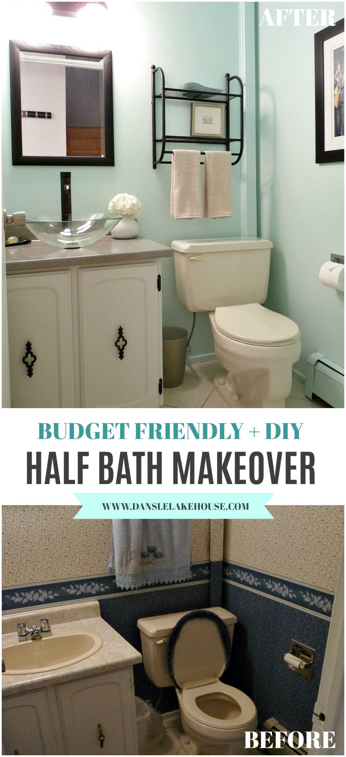
I’m so thrilled with this budget friendly half bath makeover with aqua walls! The main floor half bath has gone through a few subtle transformations already, but it needed a few more touches to make it ready for sale. When we bought the house, this is the powder room that greeted us:
Yikes.
If you remember, first I removed the blue wallpaper with gusto, then the room was painted a soft greige to help the existing elements (70s beige counter, bisque toilet and sink) blend in. A new light fixture helped modernize the space. Then we ran out of money. To save a buck, I snagged the 1970s hardware from the en-suite powder room (that was fully renovated), and applied a little leftover black spray paint. Apologies for the horrendous photo – it was taken pre-blog (with a 2.0 megapixel potato apparently)!
Budget Friendly Half Bath Makeover Products & Progress:
We obviously kept the toilet (it’s made in Canada, I couldn’t toss it!), tile (because it runs through the adjacent halls as well) and vanity (good condition, plus the tile runs up to but not under it, so we left it in place and painted it to match the walls).
With all this un-jazzed stuff, we needed something to jazz up the space.
A simple black mirror was a practical change. Next we upgraded the counter with the same grey laminate we have in the kitchen, and added a chic black faucet (see here for similar). The glass vessel sink (see here for something very similar), the jewel of the room, has been a hit with everyone.
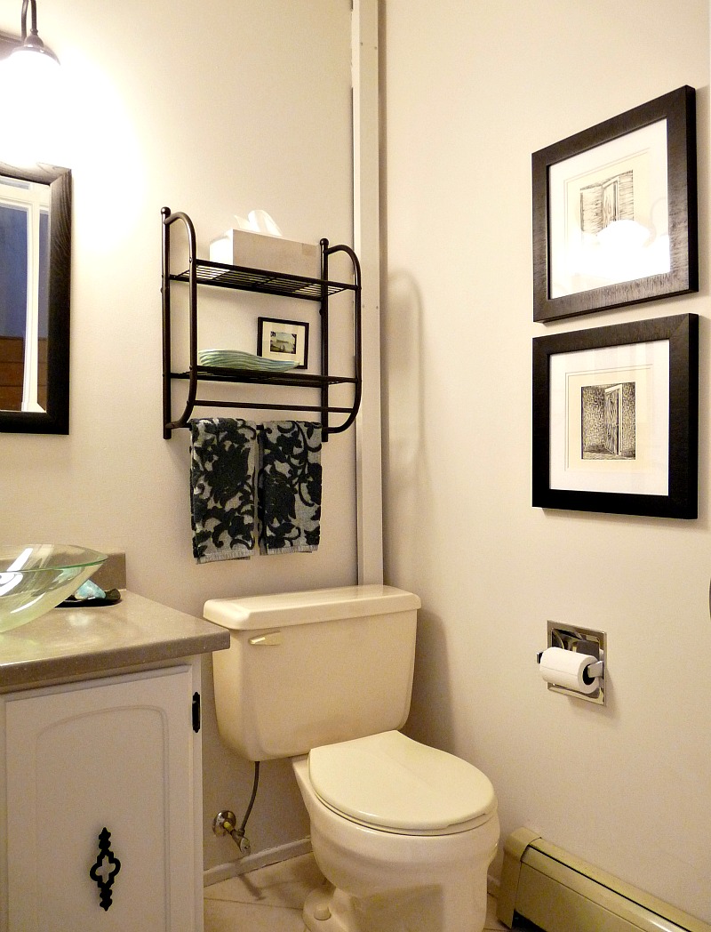
A new towel bar from Target added some storage (this one is kind of similar), and art is always a good solution for making a space seem fresh. After these changes, we had the half bath you recognize from other posts:
Although it looked better than before, despite a good wall-washing some of the wallpaper paste lingered and showed through the paint in streaks. I thought potential home buyers might think this is water damage, so I added “painting the bathroom” to our list of urgent projects. I taped everything off, taking special care to wrap the glass sink with a blanket in case anything was dropped on it. Then I primed the trouble areas with a stain-blocking primer.
My colorblind day painted it, and now the room is a soft turquoise (CIL Tropical Paradise, from Canadian Tire). Although a bit brighter and much more intensely aqua than I originally intended (I was hoping for something like this), the turquoise paint makes the space seem airier, fresher and newer. It also complements the green glass sink nicely. I wanted to add more white (like a big white picture frame with a colourful photo from Hungary blown up) but anything white in here turns green. A black-framed print (the original, which I feel privileged to have seen, is by Tamara de Lempicka) works in a pinch and ties in the emerald green from the vintage kitchen posters and dining room painting.
It’s super hard to photograph this little windowless room, but it looks so gorgeous in the photographs taken by the photographer for our MLS listing:
Let’s take a look at the before once again. If not for pictures, I would barely remember what the house looked like when we bought it. It just goes to show that a little paint and decor go a long way because the tile, cabinet, toilet are all the same! If we weren’t selling, I’d finish off this budget friendly half bath makeover and go back paint that vanity to match the walls, because why not?


Hey Tanya! This new look is a definite improvement on the original! Did your realtor have any comments about painting it a non-neutral colour before sale? As pretty as this colour is, I always thought people neutralize their houses (paint, furniture, etc) before listing.
I was worried she wouldn't like it because this turned out brighter than planned! The swatch looked like a subtle grey/aqua. But she LOVED it. I think because the rest of the house has white walls and the basement has griege walls, a tiny bit of colour is permissible. Plus, it ties in the teal accent tiles the former owners added amongst the cream/beige tile in the adjacent halls so it makes that "touch" (I think they ran out of beige, honestly). And without a window, a neutral colour looks drab and dirty in there. But I guess we'll see from feedback from viewings – I'll keep you posted.
What an paint job !!
Thanks! I guess I really have to move, so I don't fuss with this room anymore, lol.
omg, Tanya, You are a miracle worker. I love what you did with the place. You shoul be an interior designer
Awww, thanks! Doing it for me (and friends) keeps it fun! Although that was a career choice I wanted to pursue, a long time ago.
It looks great! And sure neutrals help potential buyers see themselves in a space but this is so much more complimentary that it sells (unintended pun) the room. If the colour improves the space then it makes sense. People can easily paint a small space so it wouldn't be a significant deterrent if the person was an aqua-hater.The blue makes it seem fresher/cleaner- crucial for a bathroom.I'm in the middle of a bathroom spruce, too- colouring/sealing grout. Our entire bathroom is white tile, floor to ceiling- more grout than any one person should have in their life. The original grout was never sealed. I've tried everything to clean it but have since discovered coloured sealer. Life-saver! Next project will be the shower wall grout and then caulking- yuck!Love your bathroom!
Thanks!! I think an aqua hater would have a hard time seeing past the aqua in the hall tile and the laundry room floor anyway, plus every accessory in the house is turquoise and people can have a hard time visualizing past the current owner's stuff. I think whoever buys this house, will likely not mind blues and aquas. But you're right: painting this room will be a breeze. For right now, it look sparkly fresh and that counts a lot for a space with the original cabinet and toilet!!That is a lot of grout!! Ours is not sealed but we don't have much trouble with it. Good tip to know for our next place, where I think the well water might be touch on the grout (once we replace the space portal). Good luck with your sprucing!!
Amazing! Great job 🙂
Thanks Amy!!
more minty goodness!! ok i know it's tiffany blue, but it's in the mint family!
I'm on a minty roll! It's somewhat similar to the mint table – definitely in the same family.
Love the blue! It looks great!
Thanks! It's definitely a cheery colour.
Holy Smokes what a difference.So fresh and light.I love your sink!Amy
Thanks Amy! I found it at Home Hardware but I saw it online first. I liked the squared off shape because it was different than the typical vessel sink. But then the only store that had it in stock was in a small town a half hour away, so we took a scenic drive! Every time I drive past/through that town all I can think of is if that Home Hardware has anything special the one by my house doesn't, lol.
Well it was worth a scenic drive!I just can't wait to see what you come up with in your new place.Amy
HUGE improvement! Too funny, my dad is a great painter and yet color-blind too!
What a coincidence! For my Dad, it's because he doesn't cue on colour, he looks where it's wet and so he's really good at painting good coverage even with really similar shades. Also, he sees better in the dark than colour-sighted people, he claims, but I can't so there's really no way to verify that, lol.
Hi Tanya,I discovered your blog and l am so happy. My husband and l have bought a vacation house in Romania that l hope soon it will become our permanent vacation house. In a hew months my husband retires and we will move there. You gave me the courage to use my imagination and let my artistic side to shine. I am your bigest fan. I forgot, my name is Silvia and l am Romanian.
Hi Silvia! Thanks so much for your comment. Congrats on your new vacation home! What an absolute dream – you must be so excited to decorate and enjoy the space.