This post is sponsored by HGTV® Dream Home 2018, but the content and opinions expressed here are my own.
If you follow me on Pinterest you might have noticed me filling up my boards with photos from the HGTV® Dream Home 2018. This year’s HGTV Dream Home Giveaway® 2018 is unbelievable: you can enter for a chance to win a beautifully furnished home located in Gig Harbor, Washington (overlooking the Puget Sound), plus an all new Honda Accord and $250,000 from national mortgage lender Quicken Loans®.
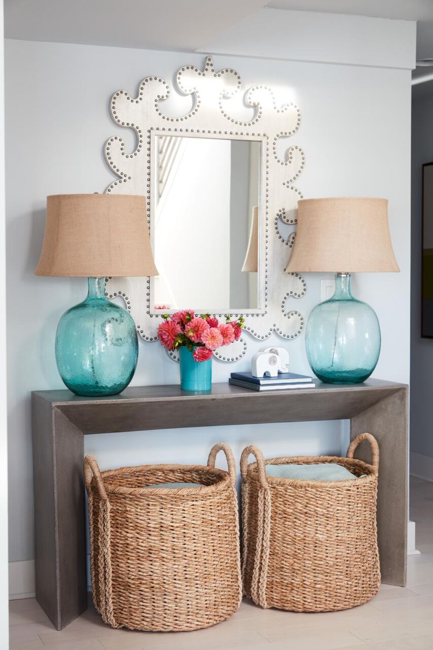
I hope you all enter for a chance to win but even though only one person can win this stunning waterfront home, we can all pick up a few design ideas. I’m aching with envy but I’m also so inspired by the modern architecture and the subtly coastal vibe. The airy design boasts a lot of white, but it’s kept interesting with layered textures, pretty pastels, and a collection of quirky accessories and art. I’m sharing a few of my favorite photos (taken by Robert Peterson, Rustic White Photography) below.
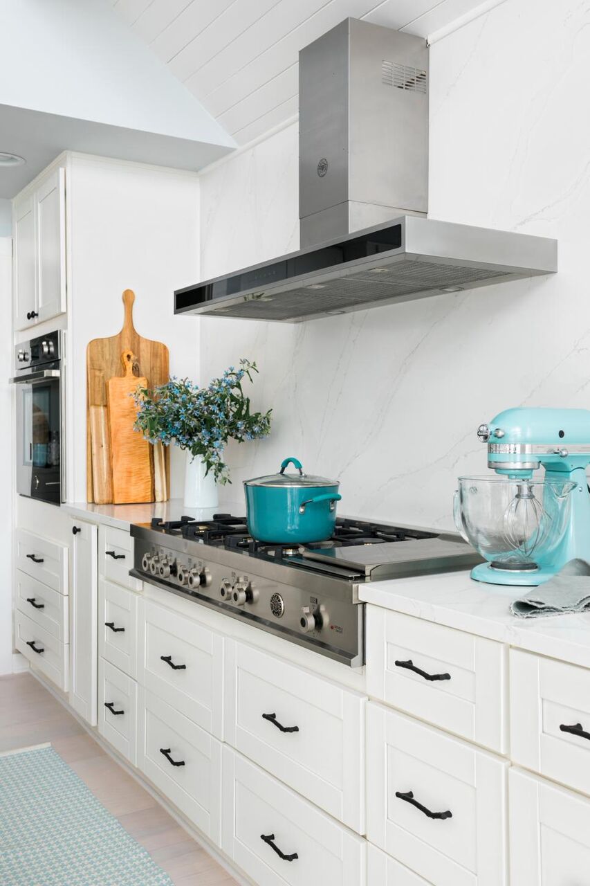
The kitchen might be my favorite room because it has really classic and timeless, all white cabinetry that’s accessorized with pretty turquoise pieces. I continually waffle between walnut cabinets and classic white cabinets in my own kitchen renovation planning, and this kitchen has me seriously leaning toward an all white design again.
Although the white on white design combined with stainless steel appliances and turquoises accessories (yes!) is a very cool palette, the touches of wood add a lot of warmth. People sometimes encourage me to break up my turquoise, blue, and white decor with contrasting colors like orange or red, but I am just too committed to blues and greens. I have a little orange and pink, here and there, but I consider warm wood tones to be enough of a contrast with cool colors.
These photos are my proof; I rest my case.
Just look at that stunning view!
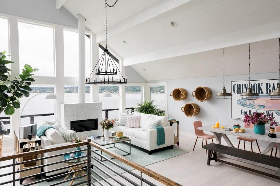
In the living room, the decor is very soft, which lets the incredible view steal the show. I am so envious of that stunning wall of windows! The placement of the fireplace is really unusual but it solves the classic waterfront dilemma when a fireplace is placed anywhere else: do I face the windows and enjoy the view, or face the fire and enjoy the warmth? The fire or the view? The view or the fire? Problem solved!
I like how the decor incorporates subtle coastal touches. There’s nary a red + navy, nautical print to be found in the open concept kitchen/living/dining but many of the textures lend a beachy vibe to the space, like the beautiful rug in the living room and the baskets hung on the wall for clever storage. The driftwood end table and soft blue hues play up the coastal location a little more, but the overall look is still soft and modern.
In the dining room, those pink chairs complement the blues and white so nicely. I love the massive scale of the artwork and the unique way it incorporates a classic nautical motif: fish!
You can get a better sense of the open floor plan from these photos.
I’m 100% behind the trend forecast of modern pastels! I am (already) done with winter, done with seeing moody hues, done with anything that feels dark and heavy. I am so ready for uplifting, spring-inspired colors and lighter decor that feels more minimal and spacious. Seeing these photos makes me realize that it might be time for me to de-clutter my lakehouse a little and infuse some more pastels and whites so my own decor feels airier and beachier…
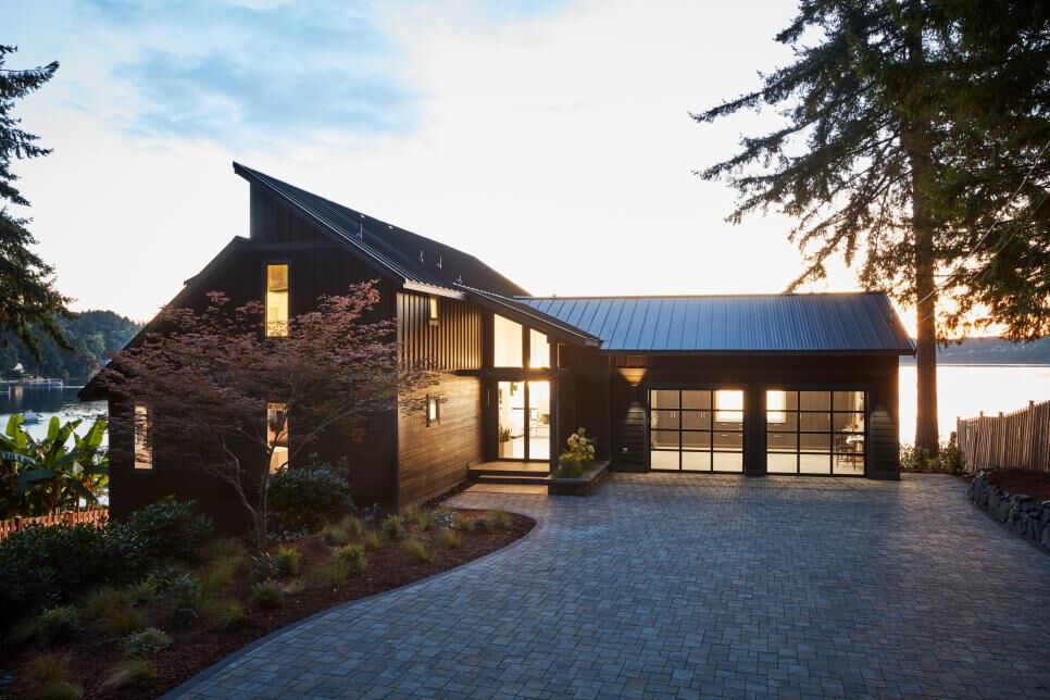
I won’t lie: this decor makes me want to tear down and start from scratch and this is just a small sampling of photos. I just want to share one more area: the exterior, along with the stunning view (that could be yours!):
What’s your favorite space or design idea from the HGTV® Dream Home 2018?
No purchase necessary. Open to legal residents of the U.S., age 21 or older. Void where prohibited. Sweepstakes starts at 9 a.m. ET on 12/27/17 and ends at 5 p.m. ET on 2/16/18. Odds of winning depend on number of entries received. For full official rules, visit HGTV.com/HGTVDreamHome or send a self-addressed stamped envelope to: “HGTV Dream Home Giveaway” RR, P.O. Box 53013, Knoxville, TN 37950. Main Sponsor: Scripps Networks, LLC
d/b/a Home & Garden Television.
HGTV, HGTV Dream Home, HGTV Dream Home Giveaway and their associated logos are trademarks of Scripps Networks, LLC. Used with permission; all rights reserved.


Yes to that white kitchen and ditto about using wood as warm accents (she says after painting all her kitchen cabinets black). You can also use a few warm metal pieces to add warmth without introducing another colour. I love Aqua/turquoise accents. My sister just installed a new white cabinets with white quartz counters in her new, very old house- I do like all white cabinets and walls however, I like some contrasts on the counters for some reason. Maybe wood and concrete counters. In this house I like that black counter (we did a concrete island countertop tinted with black- ours is a very dark charcoal grey and I love it). And very interesting that there didn't use upper cabinets (well, one above the oven) and all lower cabinets are drawers (way more accessible) except the one open shelf unit in dark wood. I have a few uppers but I removed two upper units to add open shelving- I do like some open shelves at eye level. My upper cabinets are sparsely populated so I don't need to access often. I could happily work in this kitchen (assuming they have a walk-in pantry not shown)What a beautiful view! Love all those windows.
Jealous of your sister’s kitchen! It sounds so pretty! I agree, the dark counter island here is nice. I like that it’s just a small dose of contrast. You’re right about the lack of uppers. I hadn’t even really thought about it but that’s an unusual choice. I imagine there’s still tons of storage though. Maybe no open shelving looked better for photos? And you’re right: DRAWERS!!! So much better than cupboards. Drool.
I'm not always into the HGTV dream house but this year I am ob.sessed. I can't stop looking at it!
Me too!! I don’t even remember previous ones but this one has me so obsessed! So happy you feel the same way!
I have been entering HGTV Home Giveaways for so long, HA! Every home looks amazing and I always consider moving immediately! Everything is so very well thought out……in every room and the house as a whole—-love it, love it, love it!Amy in MN—–where it's been so ridiculously cold……..brrrrrr!
Tanya – I TOTALLY agree. I prefer just the warm wood tones to break up the turquoise. I don't prefer the high contrast of orange/red/pink with the blues. I like monochramtic colour schemes better myself! I say go for the classic all white kitchen – and throw in wood warm touches 🙂 You know who to reach out to when planning!!!
I LOVE Studio Mcgee, DevOl kitchens (look them up on insta!) and Jillian Harris. I really love all those as inspiration pages! I don't like TOO high contrast (white cabs and black countertops) but like the contrast of matte black hardware. I see it all in my kitchen design world!!!
Amazing view!!! The best thing about HGTV homes is their maintenance. They are amazing and feel so lively. i would love to visit here. Everyone one lives to be is a neat and clean place and to get such, residential cleaning services nj are always there for us. Either its the carpet cleaning or the window cleaning. they are best in every field.