Many of you have been with me since I was working on my PhD. After all that schooling, you would think I’m a sparkling conversationalist, right? Nope. For the last weeks (okay, months), anyone who talks to me gets about ten minutes to blather on about whatever non-bathroom topic they favor before I pounce on them with a dizzying array of questions. Do you think I
should go with chrome or brushed nickel? Should I buy this sconce or this sconce? Sconce mirror sconce mirror sconce, or sconce mirror sconce sconce mirror sconce? Or no sconce? Who did your tile work? Is this too tall for a stone backsplash? What half of this quartzite slab do you like better? Do you know anything about towel warmers?
Don’t tell my friends and family that you got to hear about tweed, my office, agate coasters, and even a funny Szuka story to break up the bathroom monotony – I haven’t been so kind to them. There has been no reprieve.
The bathroom reno is coming along, slowly but surely. You’d think most of the decision-making would be done by now, but I have this sinking suspicion it will never end. I recently splurged on something fabulous and made a pretty big adjustment to the plan. Originally I wanted sconce, round mirror, sconce, round mirror, sconce – an extended version of this design.


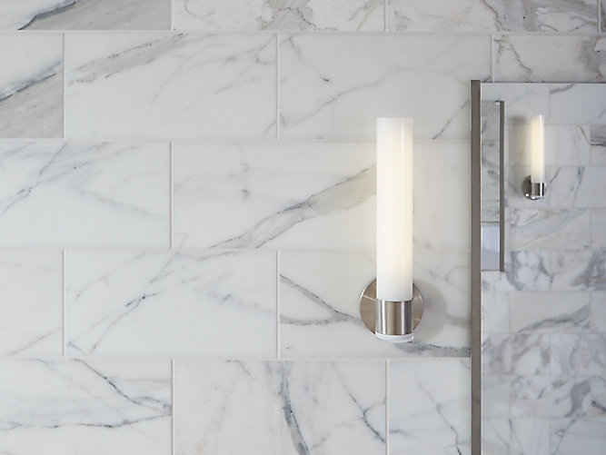
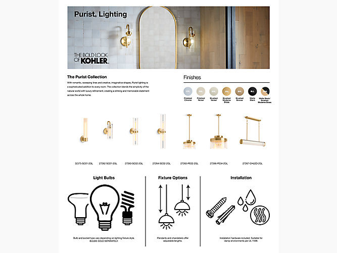
I picked out the Purist Sconce by Kohler, so the finish would match the faucets perfectly (matchy-match-match). But when I measured everything out, there wasn’t room for that arrangement unless the mirrors were very skinny rectangles, or we ditched one sconce and then mounted the remaining two very high, like in this bathroom (although I think they still have more room to play with than us). We didn’t have room for any gaps between the tower and the first sink, like in this bathroom, because we wanted to maximize the storage in the walnut cabinetry I picked out.
I jettisoned the sconce idea and decided to go with lights above the round mirrors, but then I saw Kristin’s bathroom makeover. She used the purist sconces and they look as good as I thought they would. I know that many people have grown weary of sponsored posts on blogs, but sometimes I like when brands partner with bloggers to review products. I appreciate the chance to get a better look at items I’m considering purchasing, especially because many stock photos of products don’t have a context, or are heavily edited, so it’s difficult to get a good feel for how something will look when it’s installed/used. Seeing Kristin’s photos definitely sold me.
Those SCONCES! So good. And there’s a nightlight in the bums. I decided that I had to make them work. I didn’t relish the idea of super skinny mirrors though and, truthfully, once we start dismantling the bathroom, I realized that I really didn’t want to part with my large sheet mirror at all. I’ve grown accustomed to how much light it bounces around, which is nice in our bathroom which, although it has a window – luxury! – isn’t terribly bright. Without that big mirror, it felt a lot smaller and darker. So I decided to go with something a little nutty. We’re going to keep a large frameless sheet mirror (we’ll get a new one cut to fit the space) and mount the sconces directly on the mirror, like so.
I know that many folks don’t love large, unframed mirrors; they are often dismissed as “builder’s basic,” but I happen to like the look – as long as it’s a LARGE mirror. I think it suits the modern, mid-century mod space I’m crafting. But, more to the point, I want to push the sconces as far to the edges of the mirror as possible (with the third in the middle) so they don’t
obstruct our view of our lovely mugs in the mirror. Plus, I don’t want to pull attention from the gorgeous grain of the walnut, the busy quartzite counters, or the aqua sinks (yay!). The vanity area will pack a punch, so a simple mirror situation – as opposed to a frame in yet another material – won’t compete for attention.
If you’re a little dubious about my frameless mirror choice, I promise – it can look really good. In fact, many of the inspiration photos I’ve been sharing throughout the bathroom planning process boast this look. I’m excited but also a tad nervous. We’re got a lot of the wiring changes done, but we still need to move the wiring for the new sconces, which means some very, very, careful measuring.
I’ll share reno progress photos soon, but right now it’s just bare studs and wiring, so it’s hardly riveting. Although I did get an exciting delivery yesterday (aqua sinks, be still my heart)!
I love the look! Personally it reminds me of a luxury hotel bathroom!
Oooo, I can get behind that description! I wouldn't mind waking up to a space that feels like a luxury hotel bathroom 🙂 Hopefully it turns out half that good!
I love the idea of mounting the sconces on the mirror. I've never seen that idea before… or maybe just never noticed it. I can't wait to see it in your space.
It's funny how sometimes we see something but don't pick up on it. I didn't realize how many of the spaces I liked had frameless mirrors until I actually tried to find some photos. I kept picturing round mirrors for the bathroom, but then realized that not many of the bathrooms I liked actually had them.
I'm a real fan of frameless mirrors. I had one at my last house (the main house) and in every house I grew up in. They were very popular in homes in the 1950s and 1960s. My daughter and SIL are considering going that route in their bathroom at the new house, and that's what is already in one of the other bathrooms, I'm sure put in when the house was built in 1964. You're so right about how much larger and brighter a bathroom looks with a large mirror like that.
Every time I hear your support for a design decision I've made, I feel this "whew" feeling because I love your mid-century mod aesthetic, so I know I'm steering this ship in the right direction!
Pretty sconces but that price tag x 3? Yikes! I like the idea of putting them directly on a large mirror, just make sure the reflection will look nice. I've never been a huge fan of round mirrors, for some reason they always remind of port holes on a ship lol. I also think the looks of one large one over 2 round ones is more classic and simple and inline with your style. I do like frames on them though, I guess my taste is more fussy like that though.
Yep, they are not cheap. I have snagged a really good discount from Kohler but I've also seen some Kohler products online (like Amazon) for significantly less. When I'm done the reno and have shared the reveal (a million years from now, it feels), I'll break down the budget. I'll need a stiff drink.Hmmm, maybe I liked the idea of round mirrors because they looked like ship port holes, lol. Keeping with the nautical theme I uphold in absolutely no way, despite my lakeside location.
These are some great inspiration pictures for my bathroom! I ESPECIALLY love the look of those square sconces with the mirror – looks so elegant! Thanks so much for sharing!
Happy to help! Those square sconces do look great – especially with the mirror, it's such a sharp look.
Tanya, I love a wall of mirror. Our ensuite has a huge mirror. I don't love the lights above the mirror as it is now. It has a very dated look and can't be changed. We're on the look out for a different style of light for above the mirror. I like your idea of the sconces mounted on the mirror but I do have one concern. When looking in our mirror I can't imagine a sconce interrupting the reflection, just a thought.