As you’ve seen, we made some changes to get the townhouse ready for sale. The laundry room was finally finished with curtains and fun turquoise floors. The main floor powder room was freshened up and a few cosmetic concerns were fixed. The living room was decluttered. There’s a few more things to show you, but today let’s talk about the bedrooms! If you remember from the townhouse tour, we actually use the master bedroom as a guest room. It’s large enough for a chair so guests can escape from me under the pretense of catching up on some reading, and the attached powder room is convenient and private. We, in turn, took a smaller bedroom that actually has bigger windows and a superior view of our lovely treed backyard (complete with lilacs). But our king size bed dwarfed the room, so we swapped them back.
Our bedroom looked like this . . .
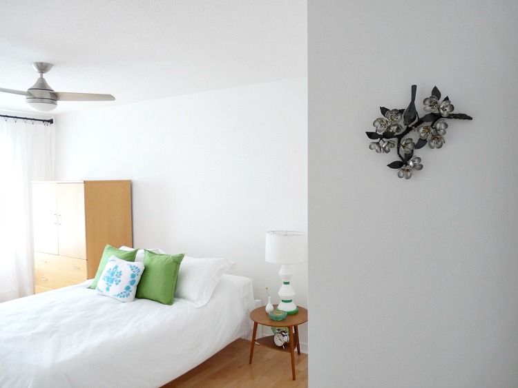
. . . but now it has the guest bed (a queen) and armoire in it.
A smaller teak side table and the thrifted lamp
(with a simple drum shade from HomeSense) do their best to balance out
my giant armoire. Frankly, I hate it. I never loved the layout of the
guest room and I could never make that maple armoire work. As much as I love the piece, it definitely won’t fit in the lake house, so it is finally going to be sold (I swear).
This room is plainer now, but that’s not a bad thing for selling,
especially because I took some liberties with turquoise floors and
walls elsewhere. It shows that a queen bed, mammoth storage unit and table fit in
here with plenty of room to spare. If this was for us, I’d hang
paintings over the bed again or make a fun headboard but the realtor
says it shows well because it’s bright, spacious and fresh (and not too nutty that it would turn off Plain Janes). Plus, my DIY triptych is still opposite the bed, adding a little colour and interest.
The former guest room looked like this . . .
. . . but now our king size bed tucks in nicely with our side tables. Our bed and tables are huge but look proportionate in here. It’s evident that if someone has a queen, there’s oodles more room. Under the windows we kept the minty chair and table but removed the lamp and clutter for a more stream-lined look. The next owner can see that a dresser would fit easily there too.
We had an open house on the weekend and have two very interested potential folks, but they both need to sort things out with the sale of their homes first, so we’ll see how that unfolds! Everyone think “bidding war!” 😉
My tips for staging a bedroom for sale?
- De-clutter personal items, but leave a little bit of colour
- Make sure bedrooms showcase the space – avoid furniture that is the wrong scale
- Adding lighting if you don’t have it, so every room has overhead and softer accent lighting
- White bedding looks crisp, clean and hotel-like, plus it makes a space seem larger!
- Open windows, wash linens and floors for a fresh, clean feeling and smell
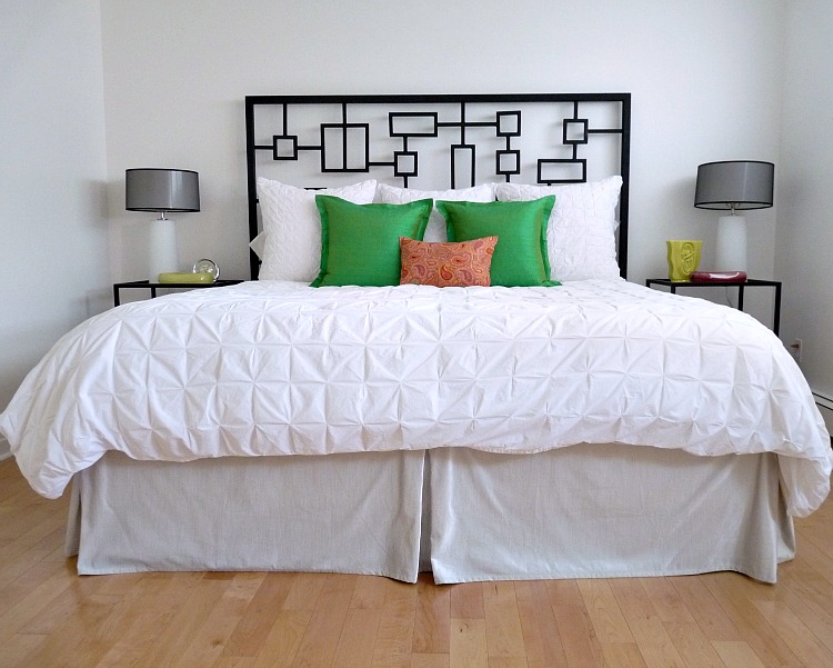
P.S. Here are the photos taken by our realtor’s photographer for the listing – I seriously want a wide-angle camera for blog photos!!
 |
| I’ve removed this armoire since the photographer took these photos – it just looked odd. |


it all looks gorgeous- fresh and clean and you should have no problem selling! 🙂
Everyone who walks in the door for a showing loves it, so I think I made the right changes (with renovating and staging). I hope to share "SOLD" news soon(ish)!!
Your house makes me drool. You have such a great eye for colour and composition.
Thanks 🙂 Right now, even with my stuff, it doesn't feel like "me" because it's all switched around and decluttered a bit. Although I could get used to less stuff . . .
I find staging to sell so interesting. Every Realtor seems to have their own opinion. Our house is on the market right now too, and one Realtor we met came in and said we needed a bunch of changes while another said we didn't even really need to remove our family photos. In the end I did remove our photos, but didn't change anything else (except for shoving a bunch of stuff in closets and drawers!). I like the changes you made…both bedrooms look really fresh and airy. I hope it sells for you!
I have found the same thing. Interviewing real estate agents, no one suggested this swap but I thought it was necessary to show the room sizes properly. And I still think the guest room looks a little student-y but that wasn't an issue with the agent we ended up working with. But it makes sense: people have different tastes and although realtors might have more experience seeing the variety of tastes firsthand, they still have their own! I removed photos too, but mostly because when we bought this place the owners' photos were out and I totally judged them like an evil, horrible person. I guess at the end of the day we have to trust ourselves a little and not just listen to everything a realtor says.
It looks amazing. I love that you kept it light and fresh with pops of color!
Thanks! I definitely love the mint chair in "my" room now . . . I don't think the guests will ever get that back, lol.
Sending my "bidding war" vibes to you! LOOKS AMAZING 🙂
Thanks Amy! It still looks so WEIRD to me. The bigger rooms makes our headboard look less dramatic. It's funny how works. Is it weird I'm happy our new bedroom is a touch smaller? The bed has more impact then.
Looks great and move-in ready! :)You're right, the wide-angle lens makes things look even better. The rooms look HUGE!
They do, don't they? The bedrooms are already pretty sizable in this house (a king fits in a secondary bedroom!) but they just look so spacious in the listing photos.
I really love your white walls… I'm always surprised that white walls is what I find to be a daring choice. haha
Haha, I used the HATE white walls. My Mom loved them but I have painted my walls turquoise, a buttery hue, pumpkin spice orange, bright kelly green . . . my first apartment away from home (with handy Hubby) had all white walls and big windows. We were too poor to paint and by the time we moved, I had fallen in love with white!! Our art really popped and the rooms seemed bigger. When we bought the townhouse, we were poor again and all-white walls meant we could save money on 5 gallon pails of paint and save time painting the house top to bottom. Now I am officially obsessed with white walls and trim, but in the lakehouse I might do bold colours on doors . . .
Hey Tanya! Looking good – I hope that you sell and that you have a huge bidding war to give you the price you need. I think that you could have a small business on the side as a stylist! In any case, one crazy suggestion, have you thought about painting the maple armoire? Maybe if you `mint it up` you might like it more….you do still that paint, after all…… (Michele, alterna grrl)
Thanks for the good vibes!I definitely thought about refinishing it, but it's extra deep (meant for a TV or clothes, back when we had tube tv's) so it's hard to fit places. There's no suitable spot in the new place. I think it would be perfect for someone with kids, because kids clothes could fit neatly in the drawers and the top is great for bulkier kids toys that can be a pain to store. It would be so cute in mint!
I was so happy and sad to hear your news about the lakehouse. While it seems like a beautiful new life, it will be sad to see you leave Ottawa. Will you change the name of the blog to `dans le lakehouse`? (m – Ottawa alternagrrl)
It's bittersweet for us too! I think "Dans le Townhouse" has a nice ring to it! Hopefully we won't move again soon, lol.