This might be controversial because vintage brass bar carts are popular but I don’t love gold in my home, so I’m going to show you a bar cart makeover and how to paint a brass bar cart glossy white! Here is the brass bar cart I recently found secondhand for $20 in the classifieds:
With the slightly smoked glass shelves, I think this is probably a 1970s or 1980s brass bar cart? I have been searching for a bar cart for over a year! So I literally pounced on the first one I found locally. Overall I love the bamboo style, I even love the glass, but I don’t love gold – or the finials (I have an idea!):
I originally wanted the bar cart for the dining room but I found the most perfectly petite mid-century teak credenza right after buying this for the dining room. So I decided to use the cart in the hall in lieu of the chevron useless table.
How to Replace Finials in a Metal Bar Cart:
The first thing I did in this bar cart makeover was remove the finials. Luckily the finials unscrewed easily, but then there was a weird, welded on frame to hold them in place inside the frame of the cart. It looked unfinished, so I needed to replace the finials.
We replaced the finials with slices of wood dowel, which we glued in. These dowel pieces fit perfectly – but definitely made painting the bar cart a necessity now!
Here’s one last look at the cart in its gold glory (which actually could have been pretty if I hadn’t removed every last stitch of brass/gold from this house, lol):
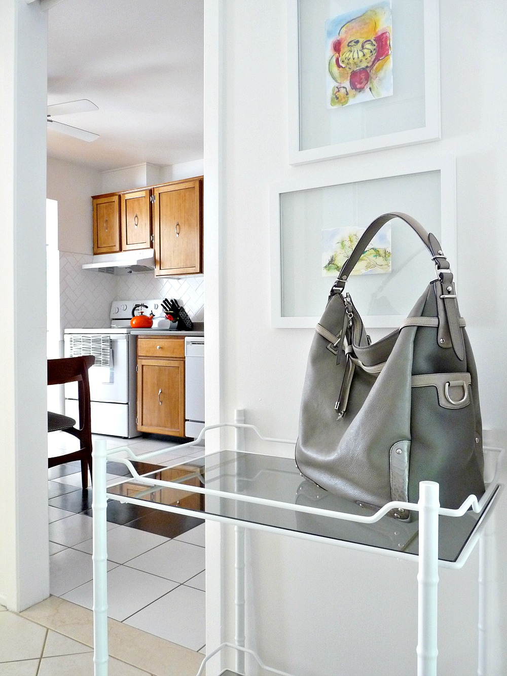
Here it is, all shiny and new. I used Rust-Oleum Universal Primer and Paint in one, in gloss white.
In this space, the glossy white finish on the bar cart complements the white embroidery on grey silk down the hall. I’ll admit, I’m undecided if I like the glossy white. I prefer it to the gold, but do we think maybe a bold color might have been a better choice?
Look how nicely the little wooden dowel caps are hidden with paint:
I love the practicality of the two shelves compared to our previous useless table because I’ve got little nicknacks on the bottom (a piggy bank for loose pocket change, a small Hungarian dish to store the iPod I grab when I go for a walk, a teak tray from Denmark that I snagged at VV), but the top is cleared for landing! I plonk my purse there the minute I get home . . .
. . . and it’s a super spot for the townhouse features sheet so people can grab one right away during showings or open houses – since the house is for sale (eeek).
Here’s one last bar car makeover before + after:


It looks so good in white!
Thanks! It certainly blends in nicely, which is good because it's a touch too large for that little nook, but oh-so-handy!
Beautiful and fun blog! Look forward to looking through all your ideas!
Thanks!! So nice of you to stop by the townhouse 🙂
oh white was the right choice, and how nice of you to Diy for your mommas house 🙂
Haha, thanks! My Momma and I are going to be working on a ton more DIY projects together now that we're moving back to the same city as her!
Love the white! It's an amazing look for that cart!
Thanks! It's growing on me because it does look fresh with the grey glass.