The kitchen has never felt “right,” even though it has so many things I love or have grown to like:
- Herringbone backsplash we installed
- Vintage teak chairs we covered with houndstooth fabric (you have no idea how many teak stools and chairs with black and white houndstooth I’ve ripped from magazines and filed)
- Black and white floors (already here when we bought the place – and have grown on me
- Fun chalkboard knife block project and microwave re-do
- Wood cabinets I painstakingly re-varnished (okay – that’s something he loved that I tolerate lol)
But my small budget kitchen design has been missing… something….
I firmly believe that every space needs art (even if it’s a DIY project or framed scrapbook paper). I was confident that the right piece would make the room work, but I tried in vain to find it (first we hung a DIY painting, then a photo I took). I am happy to report now, that I found the perfect artwork for this kitchen that helps bring together all of the elements of the space while injecting the room with color and fun:
Framed Vintage Posters:
I bought these three vintage posters when I was in Budapest. Each poster is from the 1960s, when Hungary was Soviet-controlled. The posters were issued by the Party to encourage Hungarians to shop. We had them framed in identical, very simple black metal frames. We had planned to make floating frames but decided that preservation was important, so we took the pieces to a framer that uses archival grade material. We skipped matting (it looked weird) but there are little spacers between each poster and the glass, helping air to circulate so the posters don’t get humid and stick to the glass, which can damage the ink.
I originally planned to hang the girl with the parcels separately, but an outlet foiled my plans. We had totally forgotten an outlet was hiding behind the art that was in the kitchen. Unless we wanted it smack in the middle of the posters, we would have had to hang them thisclosetogether.
We finally decided to hang all three on one wall. The middle one covers the outlet, so we were able to space them how we liked. They are all slightly different in size, so we put the largest one in the middle and lined up the tops, which was Hubby’s genius suggestion. They really really fill up the wall, adding a lot of visual interest to the kitchen. The 1960s aesthetic is a perfect fit! The textiles represented in the posters look fabulous with the houndstooth tile and herringbone seats – and the brown in the tweed suit makes the wood cabinetry feel like an intentional design choice.
Small Kitchen Tour:
My new (to me) thrifted FAB trays look fun in the space, especially because the retro fabrics really bring to life the vintage attire sold in the posters. I’m using one to corral the hand soap and dishwasher pods I like to keep at arm’s length (I’m officially too lazy to bend over and retrieve the pods from the cupboard under the sink). The horn dish is also from Hungary.
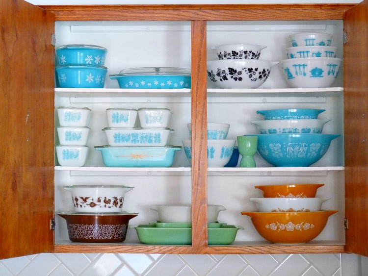
Our counters do get a daily dose of colour courtesy of my growing Pyrex, Anchor Hocking and Federal Glass collections, which we use every day.
P.S. Want to know what they say? When Hungarian is translated verbatim, it sounds like Yoda talking so perfect translation is no easy feat. Here are my super rough translations:


I LOVE them! The middle one is my favorite, though 😉 They look fabulous in your kitchen.
Thanks! That was actually the first one I fell in love with too! I'm accessorizing now and it's fun pulling colours from these vibrant posters. I can't wait for a non-dreary day to snap some more photos of the whole space.
Those are great set of posters! I can't wait to see the overall new look to your kitchen.
Dana, I knew you'd like them!!
Love them!The framing is just perfect….and i am totally with you regarding the outlet – why do builders do that? It's so annoying.
I just don't get the outlet! Our house was built pre-cordless phones, too, so I have no idea why they put it so high . . . Happy it is hidden. But someone has to remind me if I ever decide to move these posters because I'm sure I'll forget again, lol.
These are amazing! Love them! Hope you are well :)Jennyhttp://simcoestreet.blogspot.ca/
Thanks Jenny!
Szuperek ezek a plakátok, és nagyon jók a színeik! (Bár én valószínűleg a kalaposat tettem volna középre.) Holnap megyek, és veszek egy tweed kosztümöt, mert már nagyon várom a tavaszt! :))
Ez vicces! Én is várom a tavaszt!!
Haha, love the translations! The posters look great and I imagine they'll make excellent conversation pieces when you have visitors!
Definitely good conversation pieces! There is such a great history not only behind Hungarian posters as an art, but also state-sponsored posters specifically. What an entirely different world than what we know . . .
I love this! Those ads are so fabulous! It really does tie everything together.
Thanks Staci! I think I finally found the right piece. The whole room has come to life and looks put together. I planned the kitchen as the spot for the outside two from the start, but I was surprised how much better the three looked together.