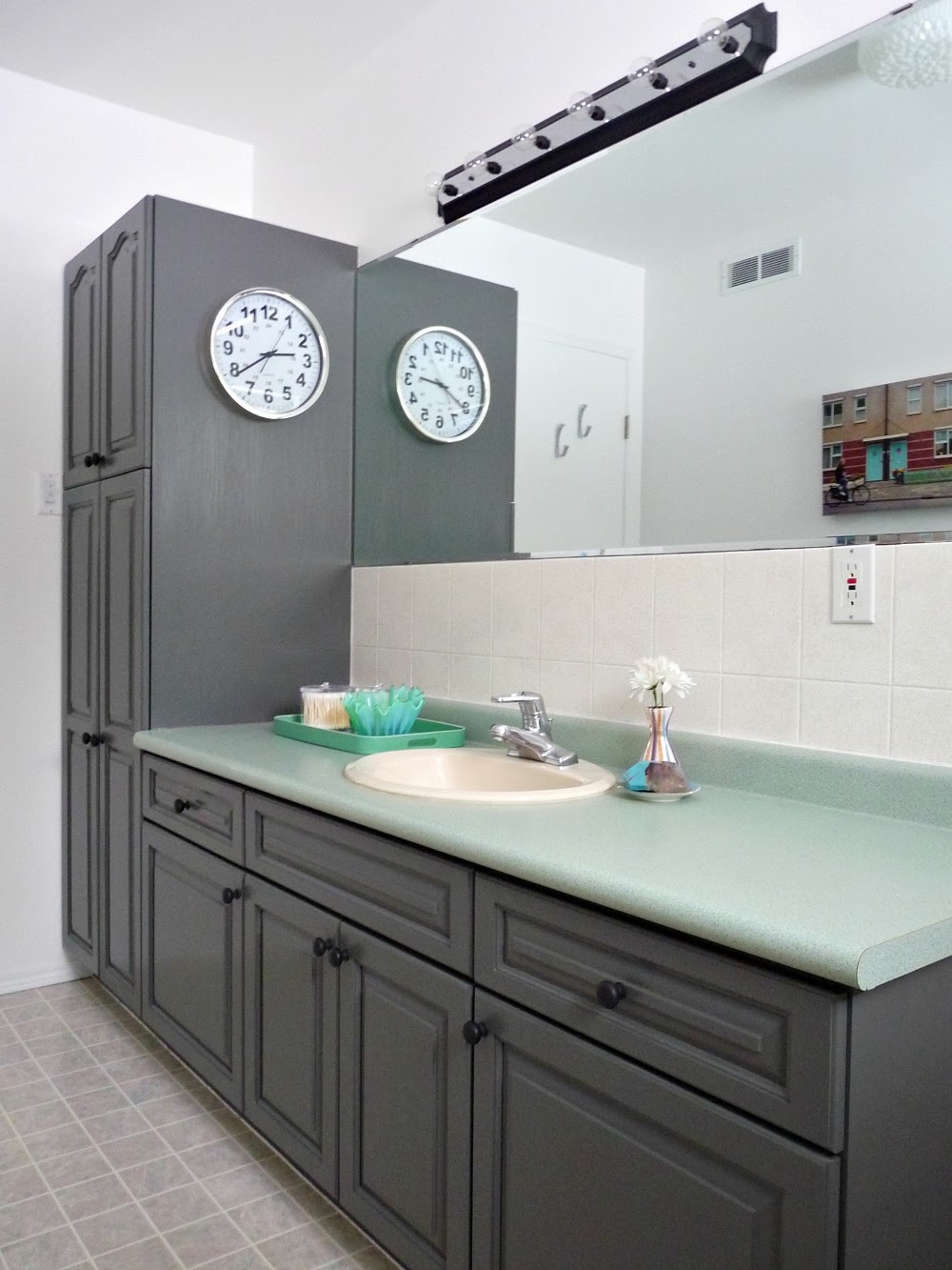
Last time you saw the main bathroom, it had already been given a top-to-bottom spruce. With the help of Rustoleum I had refinished the oak cabinetry a warm grey, hidden the dated tile behind a more subtle finish, and painted the gold hardware and light fixture matte black with leftover paint. Thanks to Canadian Tire, bright white paint on the walls and ceiling made the formerly pink walls a distant memory. An inexpensive light fixture and a small band-aid repair to the flooring made the room feel newer. Now I’ve added some art and accessories! A full renovation is still imminent although maybe not as soon as we’d like, so I’m happy I took the time to give this room a little attention.
The very first thing I did when we moved in was add a huge piece of art. I thought my black and white painting would be perfect, and it just fit. It grabs my eye and helps me forget about the shower portal.
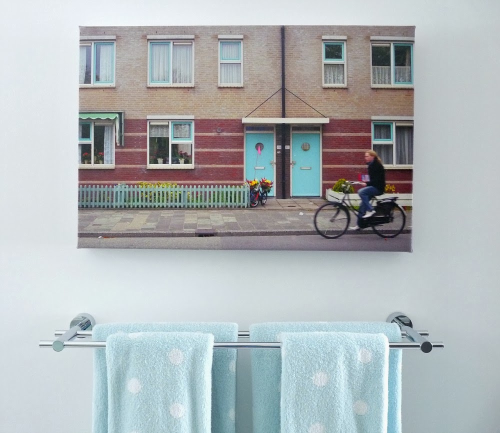
The other piece of art is a gift from a townhouse neighbor, a talented Ottawa photojournalist, who took this photo in Holland and had it printed on canvas. She and her Hubby (plus their three lovely children) were the only people we got to know in the neighbourhood. They moved shortly before we did and we were really sad when they left. I had originally wanted to paint something for this spot, but the colours in the photo just work so beautifully in the room. The circular windows reminded me of the white and turquoise polka dot towels we had in the guest half bath, so I decided the lakehouse will be a BYOT (bring your own towel).
The chrome double towel bar is from PlumberSurplus.com, who generously provided this Danze towel bar, and a matching towel ring for the half bathroom, for review. After growing so reliant on the convenience of our double towel bar in the townhouse, I searched high and low for the same idea but with a mid-century feel. This one happened to be exactly what I envisioned, because it pairs so well with the door levers. I’m trying to make thoughtful choices in the lakehouse, not choose things willy-nilly like I’ve done before.
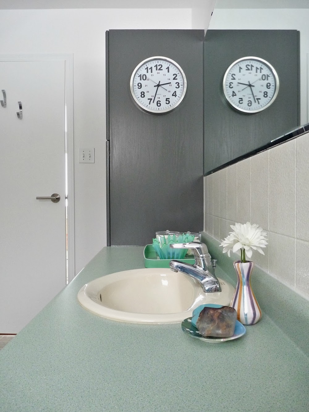
On the bathroom counter I’m using a beautiful vintage tray my stylish friend Erica mailed me. It was seriously fun to get something this pretty in the mail! It’s the perfect hue atop the minty counters. I know they aren’t cool (Jenny’s look the same, and they were swiftly covered with concrete), but they’re cheery. I am partial to mint with grey. A clock is a must for me because I can seriously lose track of time trying to wrestle my fine hair into some semblance of fullness.
Much better! The best part is, it was easy on the pocketbook. I pretty much just painted everything – even the cabinet hardware! Even when it came to adding some personality, I tried to use things I already had.
Here’s a reminder of the before:
Disclosure: Special thanks to PlumberSurplus.com for providing my fabulous chrome towel bar. It arrived carefully packaged and in perfect condition, exactly as
described, which is always my biggest concern ordering online. Any thoughts and opinions on the product and company are my own.


The bathroom looks great! I love all the touches you have done – and the cabinetry colour is a massive update! It looks fantastic! I love the cool and calm vibe that you now have going on there – yet it's still vibrant and whimsical. Great job 🙂
Thanks! Cool and calm – exactly what I was going for 🙂
I love the color of the cabinets and would love to have the color in my bathroom. I am updating my small bathroom. what is the name of the color
Author
It’s rustoleum cabinet transformations, Castle is the name of the color.
Author
Here’s the link to the cabinet painting: http://danslelakehouse.com/2013/11/refinishing-bathroom-cabinets.html
Beautiful! You're starting to turn the lakehouse into your space, for sure. Your "Tanya touches" are everywhere in the bathroom. And I love that you have a big clock in the bathroom. I always have to have one too, and someone on HGTV's Rate My Space raked me over the coals once for it. I always thought that was the strangest thing. How do people get anywhere on time if they don't have a clock?
Someone had a beef with your bathroom clock? Even if it's not someone's thing, why take issue with it? I need one in there because every other room has the time somewhere (oven, computer, tv, thermostat, phone) except the bathroom.
What?! I am totally inspired to put a clock in the bathroom now! Esp if you have kids this can help them get their act to gather and out the door on time! Great makeover, Tanya. 🙂
Thanks! A clock is totally handy. I'd be late everywhere without one in the bathroom (where I could waste a whole day trying to get my hair to look half-decent).
I have a clock in my bathroom too! 🙂
Yay! Someone else who doesn't think we're weird.
Lovely! I really like seeing how people reuse pieces! I had an awesome pink 50's bathroom in my last house and just couldn't get myself to change it up. Even left the oak cabinets.You did an amazing job!
Thanks! I love seeing people work with a space too. It can be harder to spruce than it can be to gut and start fresh. If I had a 50s pink bath, I wouldn't want to change either!
Wow! The bathroom looks great! What a difference!
Thanks!! It certainly feels fresher in there.
Kif's comment is exactly why I have some qualms about your removing that sealed-up shower/bath. I love what you've done so far – the counter/tile redo is wonderful and I would never have thought of the huge abstract painting over the toilet, and think it's amazing there – but I that shower….!!! It reminds me of a time-travel machine from the early days of films. I would expect to step into it, take a shower, and step out again on the moon! 🙂
I started to love the portal except the shock from steamy enclosed shower to chilly bathroom is horrible. The glass is also a pain to clean. I miss my washable shower curtain. But for now it stays while we tackle bigger fish!
Really great. Love what you did.
Thanks!
love the color of paint you used on the cabinets… may I ask what kind of paint did you use and the color?
Thanks! I used Rustoleum's cabinet transformations kit, in "Castle". Here's the link to how I refinished the cabinets:http://dans-le-townhouse.blogspot.ca/2013/11/refinishing-bathroom-cabinets.htmlThe kit made it easy because there was no sanding (a de-glosser is included). If you're thinking of using your own brand of paint, you can likely colour match it.
Well done. I love the mint with the grey. Amazing how even the floor tile looks pulled together with very little changes.
Thank you so much! I really tried to work with what we had and when I hung the photograph above the towels, we both looked at the floor and said "huh, the tile doesn't even stand out that much now". Something about the brick in the artwork ties it together. I'm a firm believer in art making even the most tired space look refreshed.
This looks incredible!! Have you considered framing out the mirror at all? It seems like a thin painted wood frame could really make the room. I think YHL just glued theirs on and it made an incredible difference.
I did think about it but the mirror is really crammed between the tile, light and cabinet – the outlet cover even inches onto it a smidge. A frame would have to sit on top of the mirror, when I'd really prefer to have it encase the edge of the mirror for a more polished look. If this were a longer term makeover I'd find a work around. I just kind of slapped the bathroom together and now I've moved on because I have a whole 1990s house to contend with 🙂
You have an amazing touch! I especially love your DIY canvas. How did you end up mounting it? It looks so professional!
Thank you! The canvas stretcher was warped, which necessitated a frame that we screwed into the wall to help flatter it. I have a tutorial for the frame, which could be hung the standard way (picture hanging wire) for most cases:http://dans-le-townhouse.blogspot.ca/2012/03/reader-q-diy-frame-fix-warped-canvas.html
this is amazing – such a major transformation. i especially love that clock!
Thanks! The clock has been the only bathroom accessory that has followed me from our apartment bathroom, to our first home (and townhouse) to here.
I wouldn't waste my money doing a total rehab on this bathroom. It looks wonderful just the way it is! Maybe one day changing the counter top when you want a another refresher but what you have done looks updated, clean and beautiful! Kudos to you!
Thanks, that's such a compliment! The cabinetry, sadly, is not in the best condition and it's weirdly low – hits me mid-thigh. We have a pretty small home, so we want to built a new vanity with way more storage. The shower portal also drives me insane and is also really worn out inside. I wish we could salvage this room but for the long haul, a reno suits our needs best. We'll tackle most of the work ourselves to save money, and in the end we'll have something to last us a long time.
It is fantastic. It really doesn't have that "make do the best I can" look.How did you paint the backsplash tile? I would like to paint some horrible dark green marble tile (trust me – it's ugly and the rest of the apt is white and bright). I think I can put up wallpaper everywhere except the backspace.
Thanks! Here's the post about how I painted the tile, I used a kit from Rustoleum.http://dans-le-townhouse.blogspot.ca/2013/10/refinishing-ceramic-tile.htmlI hope it covers your green marble tile nicely 🙂
I would double check that it works on marble – I have only used it on ceramic tile.
It looks fantastic. I especially love the art…interesting and not matchy-matchy! I lived in Holland (Diemen & Amsterdam) for many years and I love the canvas. I would love to know of your friend sells them!
Thanks. I've always wanted to travel to Holland for a vacation! My neighbor is a photo journalist but doesn't sell her work as art. She had accidentally ordered two prints for herself and gave me one, even though I told her she could sell it. But you could have prints of your own photos stretched like this – I'm sure you have a lot of gorgeous photos from your time there 🙂
ARE YOU SOME KIND OF MAGIC WIZARD? THIS LOOKS AMAZING.Okay, deep breaths — no more yelling. But really, yo — the highest of fives!
I seriously need to start some kind of contest for the best comments! You'd win, hands down. Thanks for the laugh (and kind compliments)!!
I can't get over what a coat of paint did for the cabinets in this bathroom. Just gorgeous. I even like the counter top, which seemed somewhat dated with the wood. Amazing. Great job. Your hard work paid off!
I love you bathroom makeover. You did an excellently job. As far as the clock in the bathroom thing, thank you so much for that idea. I will be putting one in each bathroom, but two in my son's bathroom, because once he's in there he seems to loose track of time. The clock in the bathroom idea is simple, yet it carries a BIG punch!
Can you tell me what kind of paint satin, etc and what the brand and color you used is on the bathroom cabinets? Did you use glaze in the cracks? thanks!
Of course! It's Castle by Rust-Oleum, no glazing. You can read all about the process here: http://danslelakehouse.com/2013/11/refinishing-bathroom-cabinets.html